Importance of Colour in your Design/Logo
Colour in design is very important, with one colour you can please some cultures yet offend others. Know what colours best suit your clients design and target audience, this should stop you from making the mistake. Red in most cultures is Danger, Love, Passion, Excitement while in South Africa it's the colour of Mourning and in Hebrew it is the colour of sacrifice and Sin. So you need to look deeper in to your clients brief to see if any particular colours will offend them and their audience. Your Logo do the colours attract your target audience, will it be used world wide how will other people react to your logo... All this is very important in your designs. Know your Client & Your Target Audience.
I used the website below to research my colour in different Cultures Doc, that you can see below
http://www.empower-yourself-with-color-psychology.com/cultural-color.html
I used the website below to research my colour in different Cultures Doc, that you can see below
http://www.empower-yourself-with-color-psychology.com/cultural-color.html
The History of Symbols
Symbols & Their Impact in Logo Design
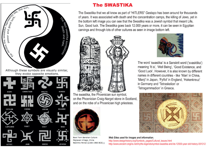
One of the most dynamic tools graphic designers use to create great logos is the symbol, Symbols/logos are everywhere. They are on your breakfast cereal packet in the mornings and on your bedding at night. A symbol, for us in the design world, is usually a combination of graphic elements that represent something to us-in other words, a picture that tells a story. The last thing, we want to do is use a symbol incorrectly and as a result make a client look bad, symbols have different meaning in different cultures. take a look at the swastika I have shown above, we all know it as Adolf Hitlers symbol in WWII and the Death in concentration camps of millions of Jew's. Yet in other cultures it means Peace, Good luck, Life & the Sun. Do not use multiple symbols in one logo or brand that might possibly represent conflicting ideas. It is ok to combine forces, but be careful to not overload on symbols. Symbols are powerful communication devices when used wisely. One smart symbolic element in a logo design can express everything, symbols have friends and they have enemies. The designer must learn to recognize how this will affect the overall impact of the brand and logo.
Web sites used for Refrence and images.
http://www.designhistory.org/Symbols_pages/symbols.html
http://www.designhistory.org/Symbols_pages/Cultural_issues.html
http://www.hongkiat.com/blog/symbols-impact-on-logo-design/
Web sites used for Refrence and images.
http://www.designhistory.org/Symbols_pages/symbols.html
http://www.designhistory.org/Symbols_pages/Cultural_issues.html
http://www.hongkiat.com/blog/symbols-impact-on-logo-design/
Andy warhol
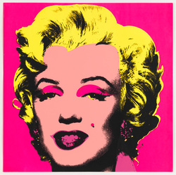
Andy Warhol was a successful magazine and ad illustrator who became a leading artist of the 1960s Pop art movements. As Warhol himself put it, "Once you 'got' pop, you could never see a sign the same way again. And once you thought pop, you could never see America the same way again."
Warhol took everyday items and household names and produced iconic images of them such as the Marilyn Monroe image on the left. Other iconic images he used were the Campbell's soup can & Coke-Cola bottle, these were all done in many very bright florescent colours mainly in screen print form. These images have an iconic comic book look to them and are often seen in group's of four or more in contrasting colours, this made things easy for the mass market.
Below you can see the image of Marilyn Monroe that Warhol used for these images. His portrait " Eight Elvises" (Below) eventually resold for $100 million in 2008, making it one of the most valuable paintings in world history. Warhol was one of the most famous faces of the New York scene for most of the 60's, 70's & and early 80's often seen in the night clubs such as "Studio 54" till his death at 58 in 1987. Warhol communicated with his audience through the medium of colour in his work's of everyday objects and people.

One of Picasso's famous works
The painting left is Guernica from 1937, It was created in response to the bombing of Guernica a Basque country village in northern Spain, by German and warplanes at the behest of the Spanish Nationalist forces on 26 April 1937 during the Spanish civil war. This is a very dark painting, that shows the death and destruction of the Village of Guernica. It shows the horror of the people, there is no colours other than black, white & grey's in this and I think that it is very striking and grabs the attention of the viewer. Both these paintings are in the cubism style, Cubism was the first of the Abstract Art movements of the 20th century and Picasso and Georges Braque were the main founders of this style. An art critic at the time said one canvas looked like a sheet of broken glass. This style almost looks like that it has been done in mosaics, the style is very angular and sharp with almost no curves. The paintings look as if they have block printed. Picasso was not just a painter he also was a great sculptor, print maker, ceramicist and stage designer, Picasso was considered radical in his work and was the inspiration to many that followed. Picasso communicated with his audience through the medium of shape.
.
