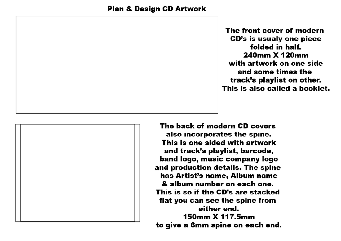
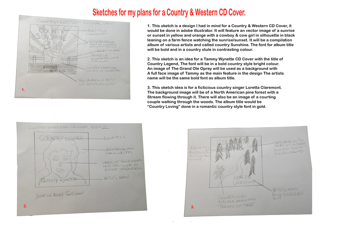
Plan & design 3 CD artworks
The first CD artwork I am going to design is for the Punk Rock Genre of music. These CD covers are for bands that have an anger and are anti establishment. Many of these covers only use two or three colours, Black, White & Red. That is what I plan to do (see moodboard & sketches). The text/font style on most of these covers is also an angry aggressive style and shows the bands could not care less attitude.
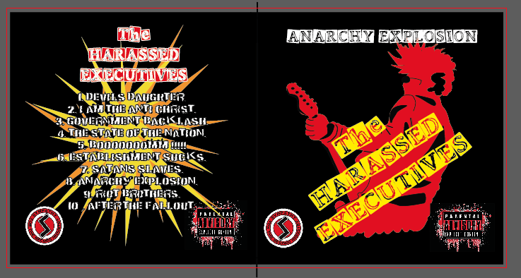
The CD artwork that I am going to be doing is for a Fictitious punk band called the Harassed Executives, the album name is going to be
Anarchy Explosion. The audience this is aimed at is the Punk rocker old or new there is no age limit to Punk.
Anarchy Explosion. The audience this is aimed at is the Punk rocker old or new there is no age limit to Punk.
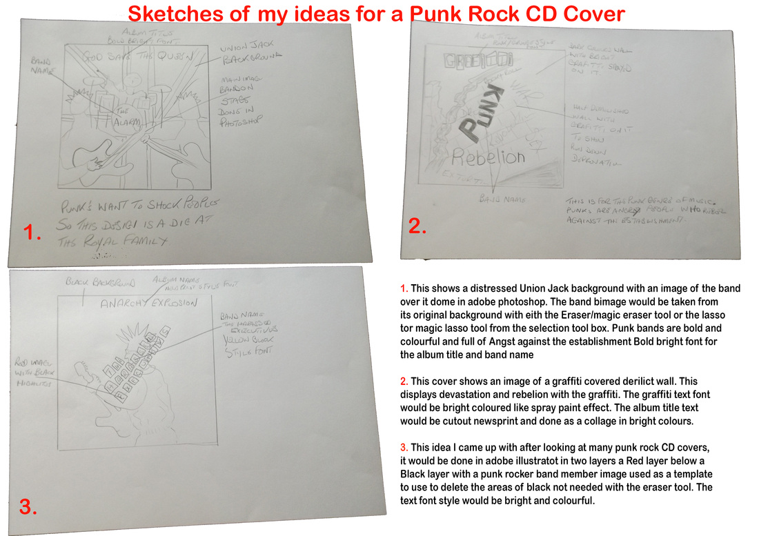
Above you can see some sketches of my ideas for my Punk Rock CD cover.
Below are screen shots of my Template layer
Showing my Layers palette.
Below are screen shots of my Template layer
Showing my Layers palette.

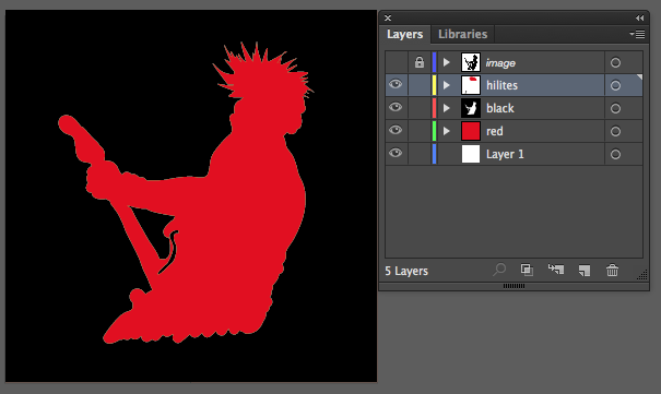
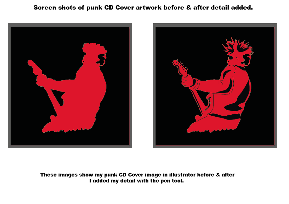
The image to the left is a screen shot of my artwork in illustrator, showing my layers palette and my template that I used for the figure (i moved this to one side so you could see the image below) as you can see in my layers palette my template layer is on the top of the others. With the template placed over the black layer, I make the black layer active by clicking on it in layers palette the take the eraser tool from the tool box and start to delete the black layer to reveal the red underneath. I added the highlights to their own layer as you can see in screen shot. The screen shot below I have placed the template layer back over my artwork and you can see that they are not exact copies of each other but very similar.
A template layer is a layer of reduced opacity that is used to trace an object. This layer can be turned off & on as required to show your artwork. this enables you to create your artwork to copy the original.
A template layer is a layer of reduced opacity that is used to trace an object. This layer can be turned off & on as required to show your artwork. this enables you to create your artwork to copy the original.

Above you can see my work on my Punk Rock CD cover, Still a few tweeks to do. Someone who has seen it said "It's very PUNKY".
|


|
|
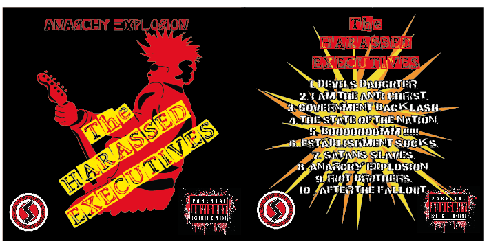
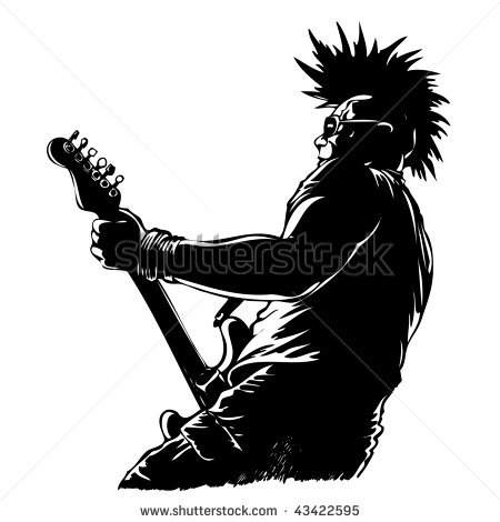
I created my Punk Rock CD Cover in adobe illustrator, above you can see the image that I used as a template for the main image. I firstly opened a Black layer & red layer with the black on the top
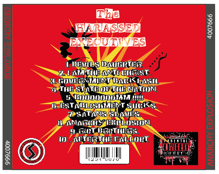
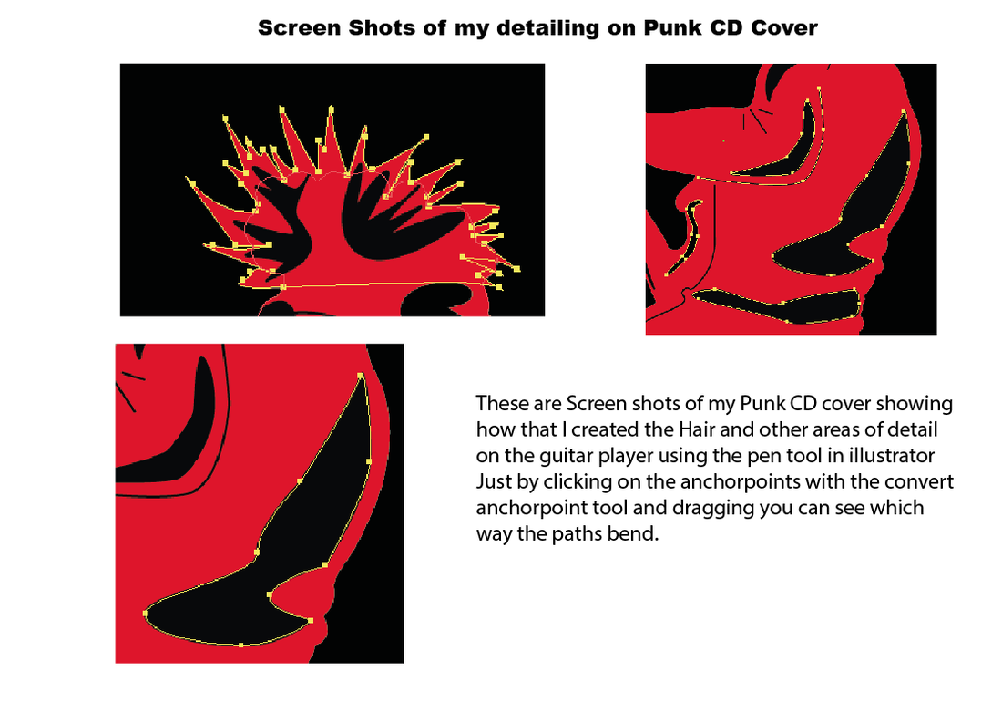
(you can see my layers palette in the screen shot to the right). I then opened the image on top of these layers and changed the opacity so I could see the layer below. I then used the Eraser tool from the toolbox to trace & delete the areas of the black layer I did not need (black layer needs to be open/active to do this). When that you have got your basic shape you can select different anchor points on outline to move them with the Direct selection tool as I have done for the hair. You can also do your curves with the Convert anchor point tool (find this in the Pen tool in the toolbox) you do this by clicking on the required anchor point and dragging it in the direction you need you can see the path line moving to determine how you want the curve. I then added highlights with the pen tool and created curves in the same way. With the back cover I reversed the colour layers to make the Punk guitarist like an outline Then made a star shape with my pen tool multi pointed to portray an explosion then copied & pasted it , changed the colour and rotated it. Below you can see my CD cover with all the Text added and the logos, The logos were firstly opened in adobe photoshop and their backgrounds were removed with the Eraser/Magic Eraser tool from the toolbox. These were then saved as a PSD then opened in the illustrator artwork, I had to resize these by dragging the corner when the image is selected while holding down the shift key, this keeps the image in proportion. The text in the design I searched for in DAfont.com, to find a punk style then just changed the colour to contrast the design. |
|
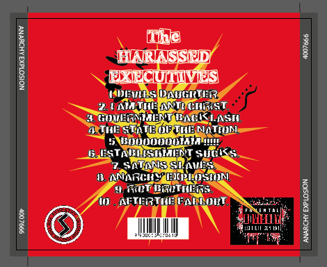
Above are screen shots of my final cover front in illustrator showing Bleed marks & fold marks to guide the printer when printing out the artwork. The front is in booklet form so will be folded in two to create this, some times you have text inside this I have not.
And my Backtray showing my marks where it will be folded to create the spine of the CD Cover.
And my Backtray showing my marks where it will be folded to create the spine of the CD Cover.
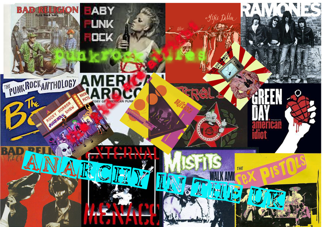
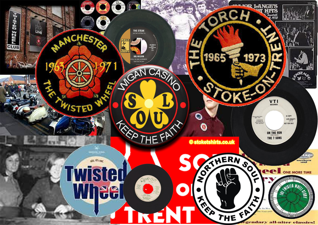
Northern Soul Moodboard
Northern Soul
In the late Sixties, a new youth movement burst on to the scene. Combining a passion for soul music and an appreciation of talented dancers with a love of amphetamines – in the unlikely setting of towns such as Wigan, Stoke-on-Trent, Manchester and Blackpool – this is where the name "Northern Soul" came from because it was all based in the north opt the country.Northern Soul helped redefine youth culture. The old joke about the Sixties was that if you could remember it, it meant that you weren’t there. One person says: "Dancing was empowering. Some people sold drugs to get noticed and be accepted, some sold records for the same reason, some people deejayed, I danced”. I first listened to Northern Soul in 1972 at my local youth club disco and was amazed by the music from obscure American artists, most of the records were American imports. I was a Mod I had a Lambretta scooter and loved the fashions of the day, I could not dance like the others but was amazed with all their Spins, Kicks & Backdrops. The main clubs for this were spread all across the north Manchester had The Twisted Wheel, Stoke on Trent had The Torch, Blackpool The Mecca and the most famous one of all was in Wigan called Wigan Casino. In wigan Casino they had the well known All Nighters where the best dancers male & female would dance all night on just Coke or water & amphetamines.
In the late Sixties, a new youth movement burst on to the scene. Combining a passion for soul music and an appreciation of talented dancers with a love of amphetamines – in the unlikely setting of towns such as Wigan, Stoke-on-Trent, Manchester and Blackpool – this is where the name "Northern Soul" came from because it was all based in the north opt the country.Northern Soul helped redefine youth culture. The old joke about the Sixties was that if you could remember it, it meant that you weren’t there. One person says: "Dancing was empowering. Some people sold drugs to get noticed and be accepted, some sold records for the same reason, some people deejayed, I danced”. I first listened to Northern Soul in 1972 at my local youth club disco and was amazed by the music from obscure American artists, most of the records were American imports. I was a Mod I had a Lambretta scooter and loved the fashions of the day, I could not dance like the others but was amazed with all their Spins, Kicks & Backdrops. The main clubs for this were spread all across the north Manchester had The Twisted Wheel, Stoke on Trent had The Torch, Blackpool The Mecca and the most famous one of all was in Wigan called Wigan Casino. In wigan Casino they had the well known All Nighters where the best dancers male & female would dance all night on just Coke or water & amphetamines.
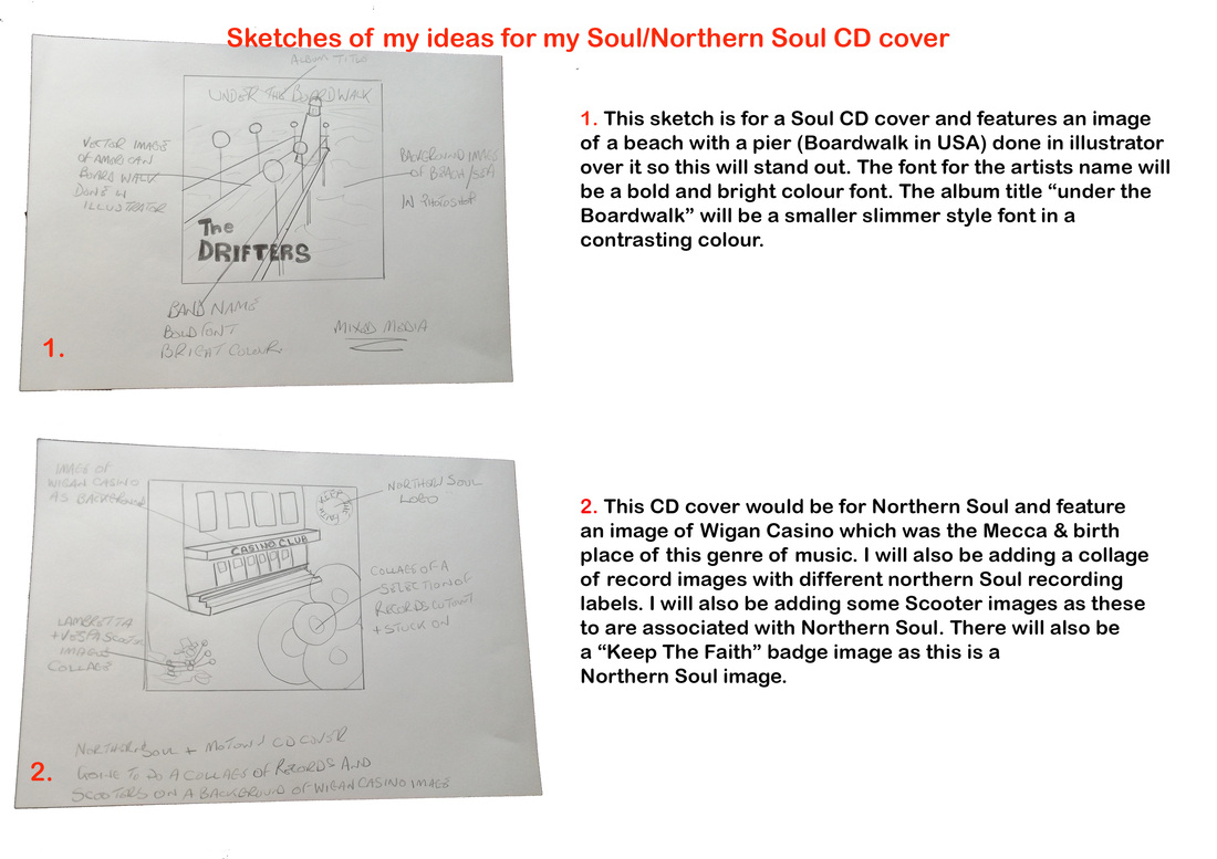
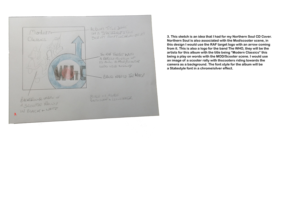
The below images are for my Soul/Northern Soul CD Cover ideas

|
|
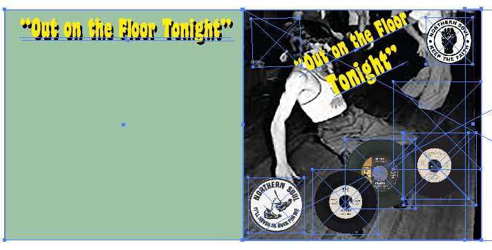
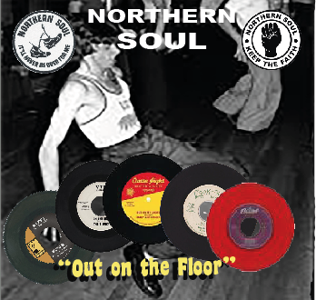
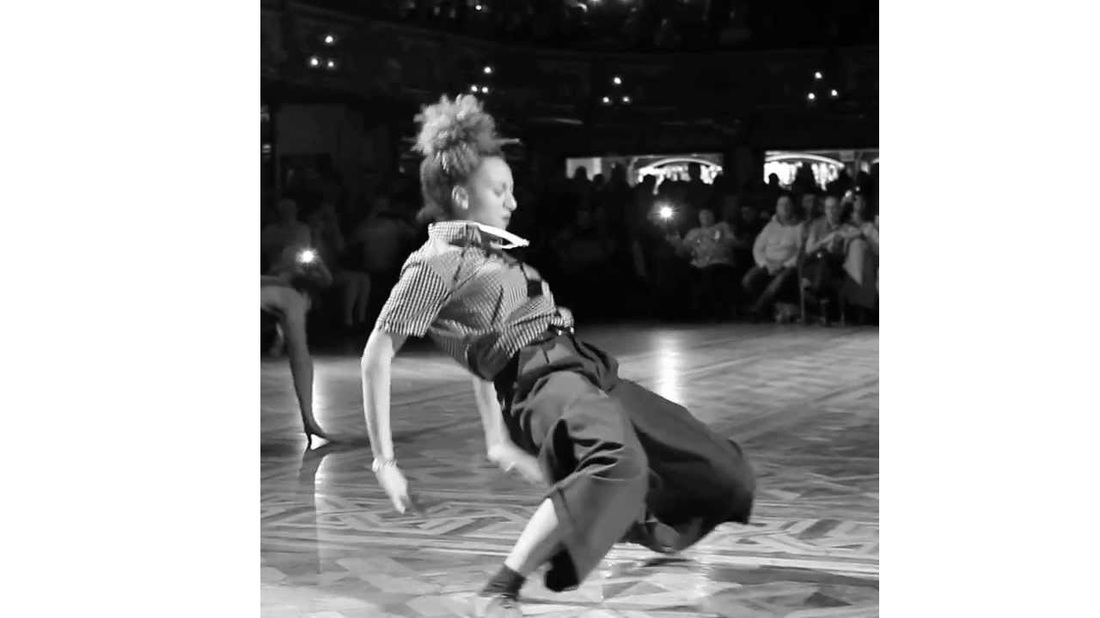
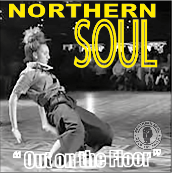
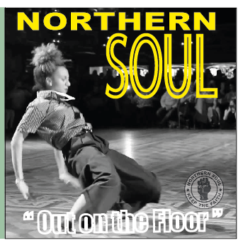
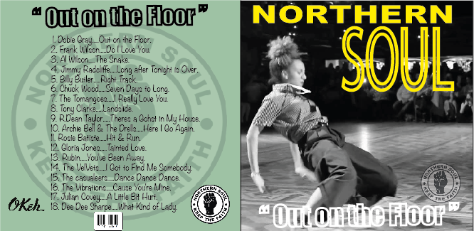
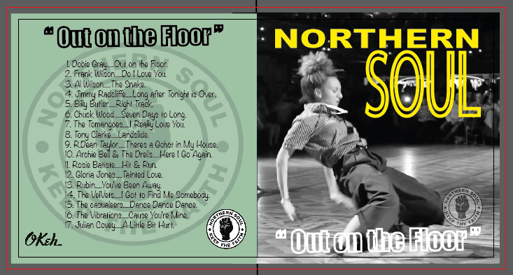
Above is the start of my Northern Soul CD cover, this is still a work in progress. The background image of Wigan Casino (the mecca for N/S) may be changed to an image of N/S dancers, as the album title "out on the floor tonight" is a fomous N/s track. The image on the right is my second layout this time with a northern soul dancer image for the background. The three images above are different stages in my planning for this CD cover, The last image shows all the paths images in illustrator. I used photoshop to delete the background from the record images (the eraser tool & Magic eraser tool were used for this from the selection tools) then imported them into illustrator. The dancer image was cropped in photoshop to then imported but this image was to small and pixelated so was discarded for the image below. I brought this all together in illustrator as I find this the easiest software to use for this.
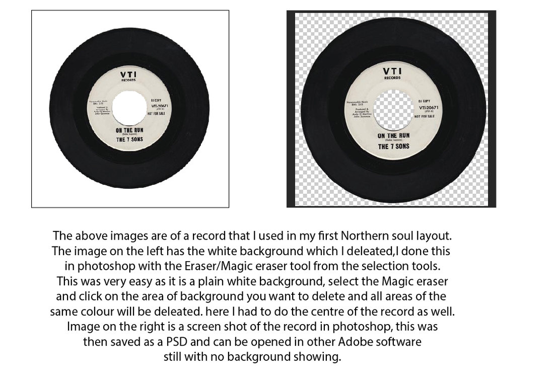

Image above was cropped down to get the dancer central for my layout
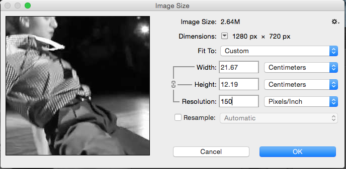
The images above and right are my final CD Cover images, The image above left of the dancing girl was to close to the text for album title. I made image slightly larger and moved it left slightly to give more whitespace. While I was doing this the image became pixelated. For print work images need to be at 300 ppi at 100 percent. The image right is at 150 ppi this is acceptable for my coursework. It is very important to have your images at the right size when going to print, the resolution must be correct. If you are getting images from the internet search for large images. larger than 2megapixel are fine.
|
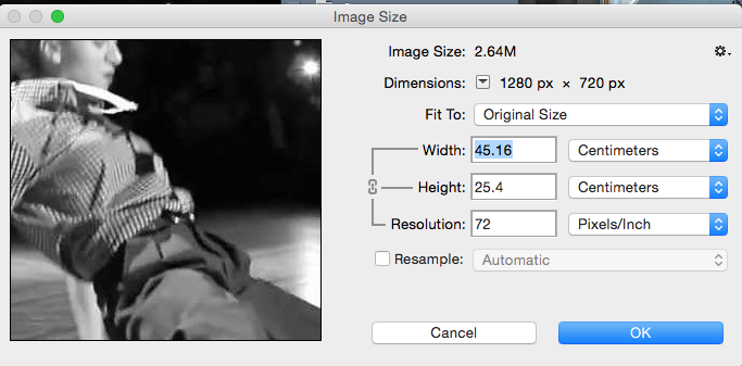
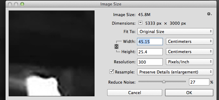
The resolution of this image below was 72ppi when I opened it in photoshop i tried to change to 300ppi but this made the image pixelated so it was reduced to 150ppi and was fine for this work.
|
Below are 2 screen shots of my image showing the image size window open. the left image is the original image set at 72 ppi, I have tried to convert to 300 ppi and as you can see the image on the right has gone large and pixelated while the image below these is at 150 ppi, the image has gone bigger but not pixilated.
|
|
The making of my Northern Soul CD Cover started with me searching the internet for a good dancer image. The image I found had two images together a man and woman so I opened it in adobe photoshop, I used the Rectangle Marquee selection tool to put around the female dancer then created a new layer and copied & pasted the image onto it, then I deleted the first layer to get rid of the rest of image.
I opened the chosen images in Adobe illustrator, along with some other images associated with the northern soul scene and started to create my layout. I used illustrator for this because I can import PSD files into it easily and manipulate them as required.
|
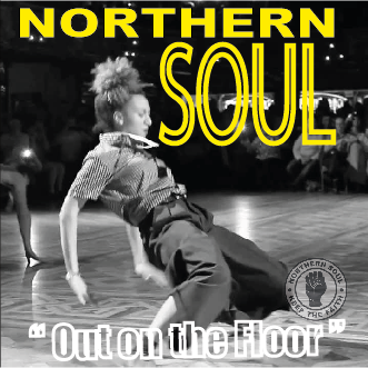
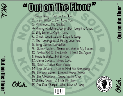
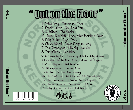
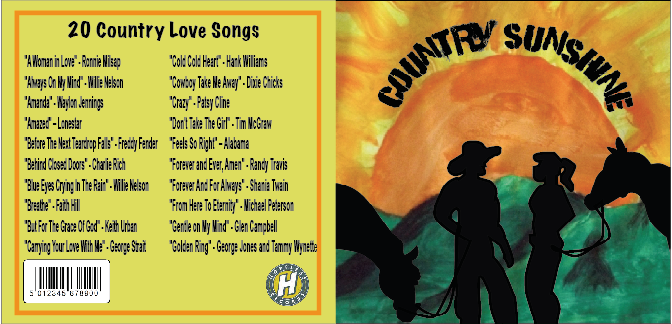
Above and left you can see my final Northern soul CD Cover, above is the front cover booklet and left is the back cover incorporating the spines for the case. The image below I have made the record label Logo on the spine smaller as when I printed this out it was folded now it's fine.
|
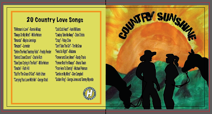
Above and below are screen shots of my document in illustrator showing Bleed marks & fold marks.
This is for the printer to determine the correct size of the artwork.
This is for the printer to determine the correct size of the artwork.
Country & Western Moodboard
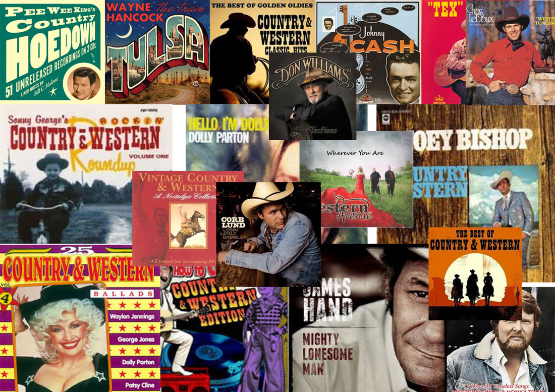
Country & Western genre music has been going for quite along time, it started with the cowboys of North America singing love songs to their sweethearts. There was no other type of entertainment in those days. It has come on a long way since them times and is a multi million dollar business with millions of fans around the world of all ages. In my mood board you can see album Covers that would go back to the 40's & 50's no CD's in them days. Lots of different styles of artwork as well.
Traditional Artwork for my Country & Western CD Cover
Below you can see the different stages of my artwork and materials that I have used.
Below you can see the different stages of my artwork and materials that I have used.
|
|
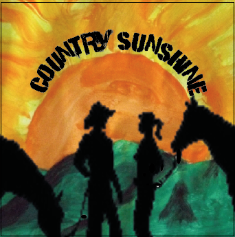
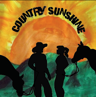
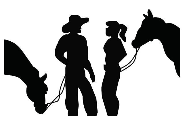
I firstly opened my painting in Photoshop to delete the background and then Illustrator to square it up. I then added a image of Cowboy & girl with horses and some text.
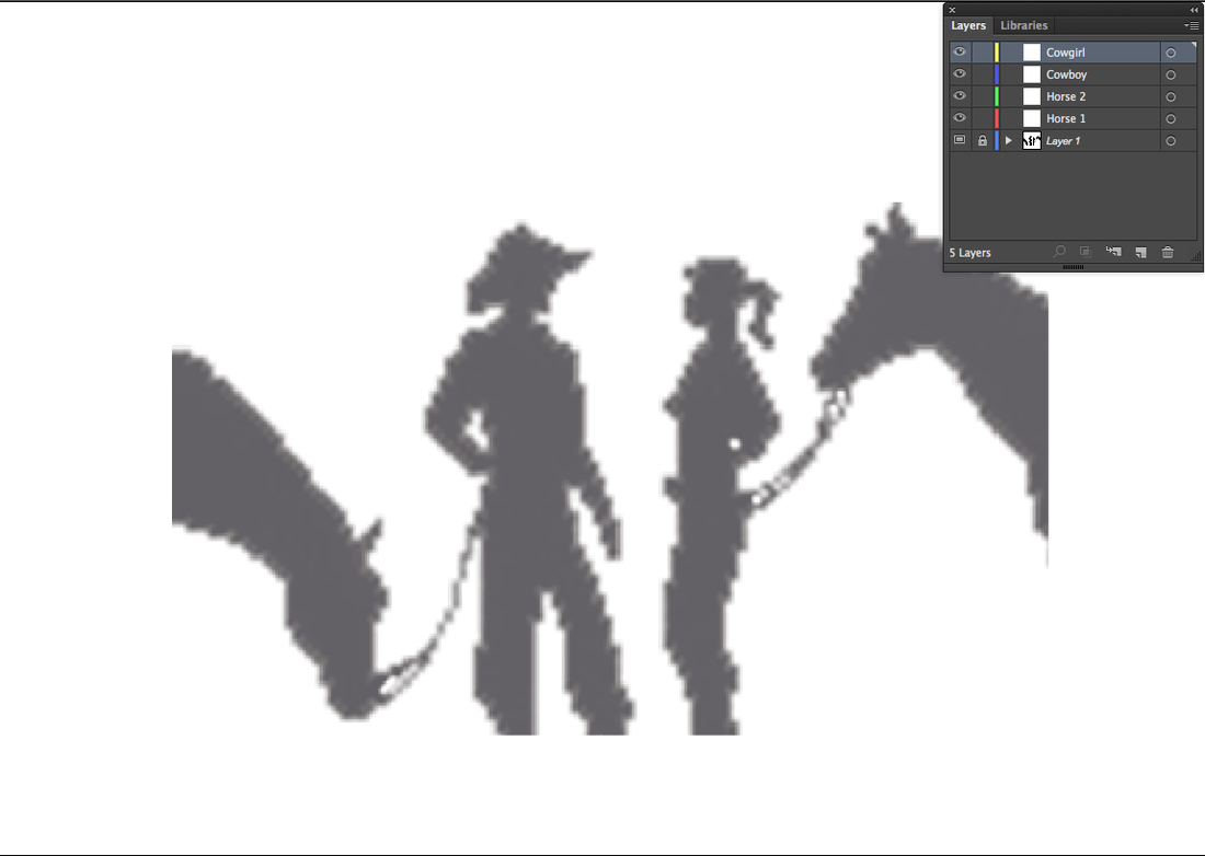
Pixelated image below opened in illustrator and set as template, notice the layers panel with a layer for each item.
Below you can see my image that needed a few tweeks, i made girls chest smaller and one or two other minor tweeks. You can see the difference in image to right.
|
image below i what I used part of for my Image.

The silhouette of the Cowboy/Girl & horses is pixelated so I will do one myself in illustrator. The Pixelated image below.

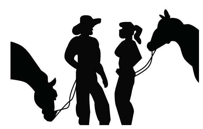
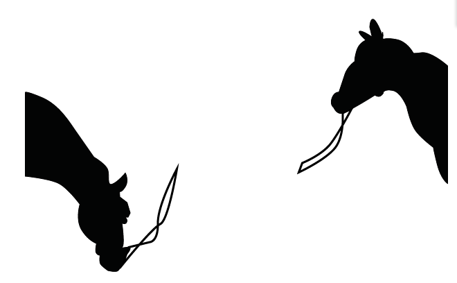
Image below is of the two horses i created with the template turned off.
|
This section of my work has been very rewarding, I have used my painting skills (not that I have any), I have used my photography skills to take a photograph of my painting which I then opened it in photoshop to take background away and Illustrator to bring the design all together.
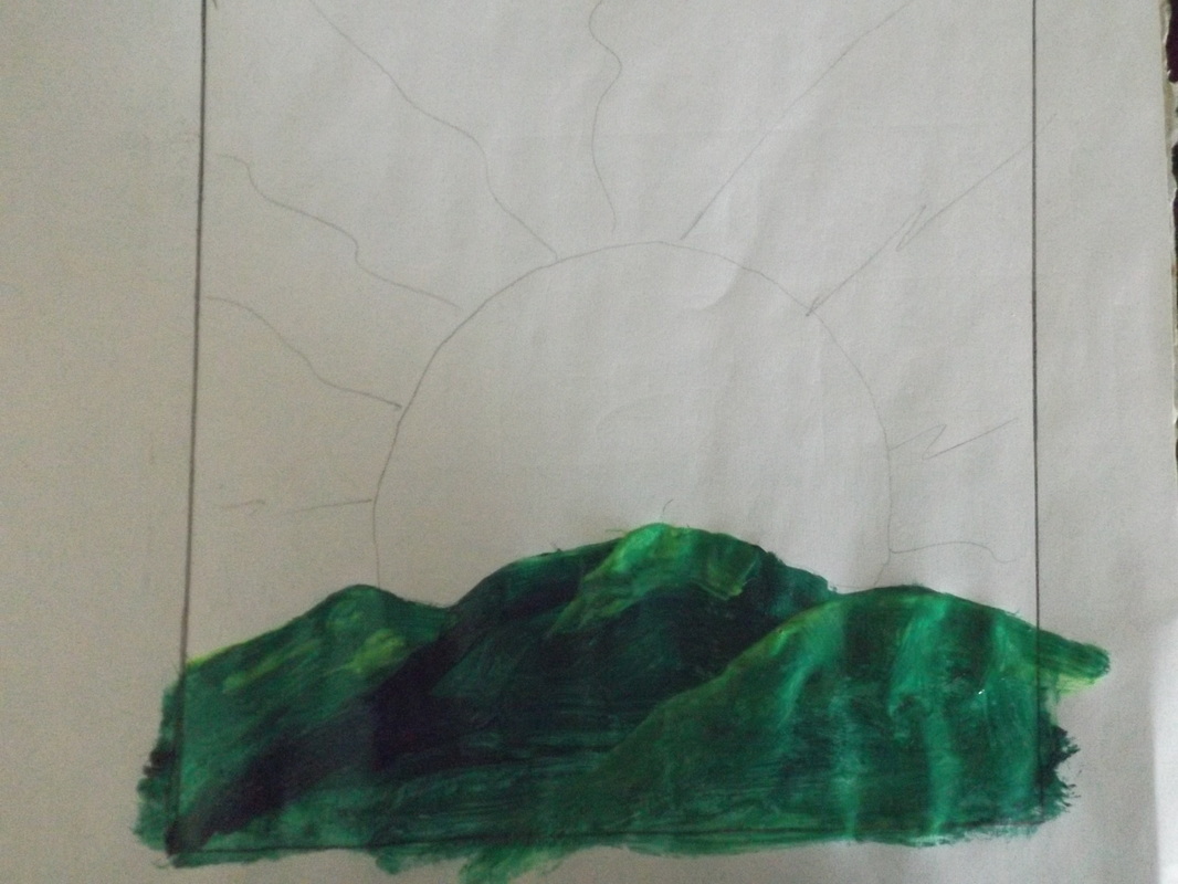
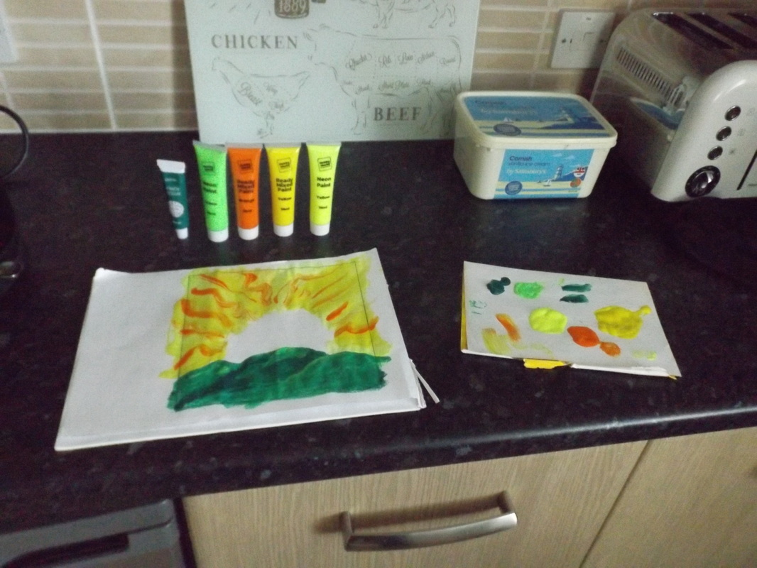
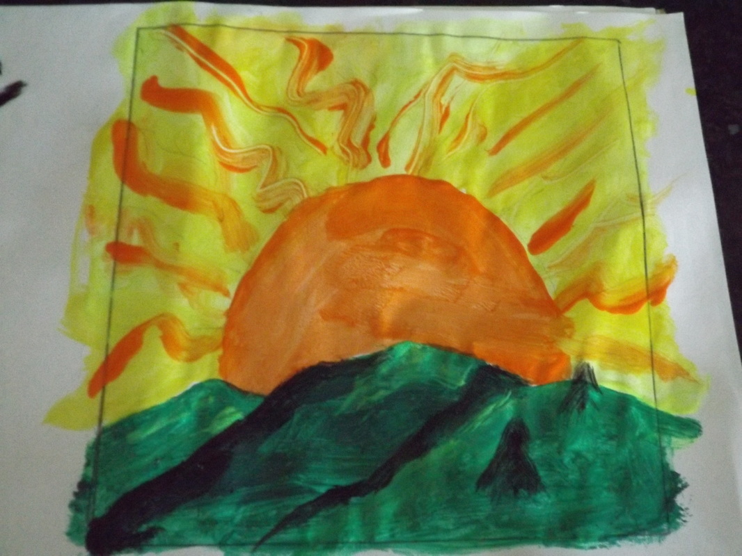
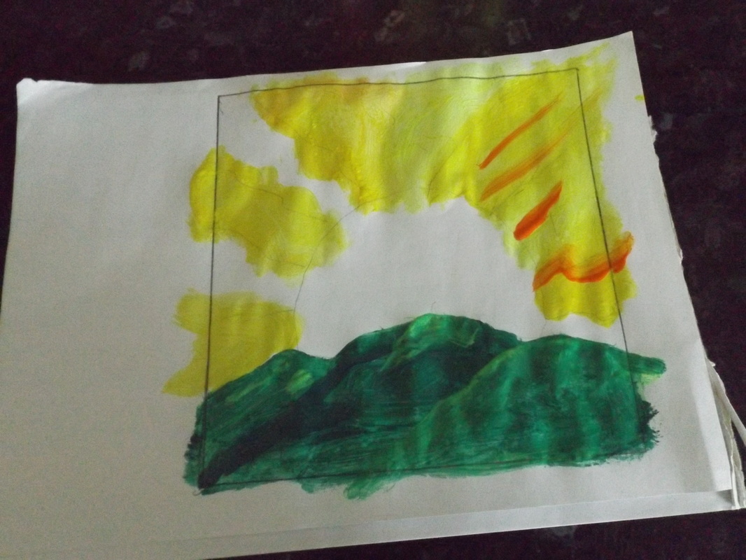
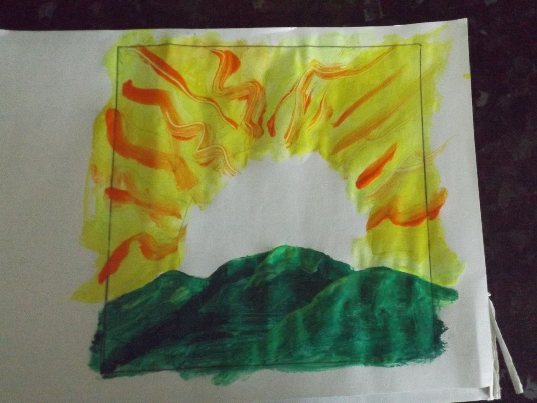
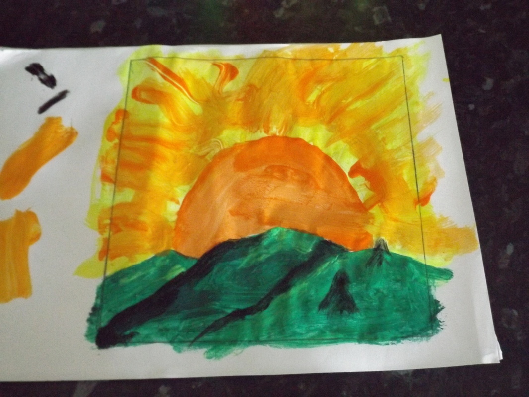
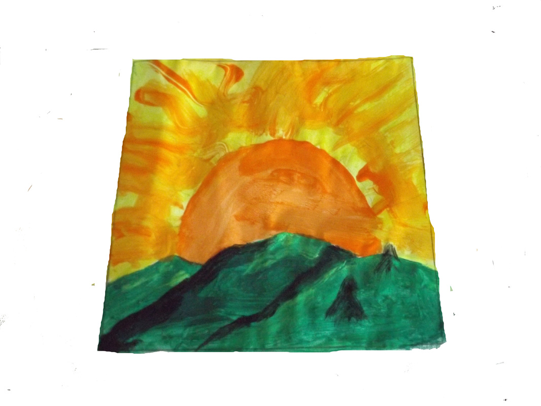
Firstly I done a rough light sketch for my painting template, I done this on my sketch pad which is quite thick paper, Canvas could have been used for this but I found paper easier to work with. I then started my artwork mixing colours as I went along for different shades (I used oil based paints this is easier to mix colours with a thick and thin brush). For the hills first using three different greens and black then the sun and sky was done i used different shades of orange/yellow. I took photos of each step to add to my course work, then opened the final image in photoshop so I could delete the background with some of the selection tools (eraser, Magic eraser).
I then opened the PSD in illustrator and scaled it down to the size I needed. I used an image I liked from the internet for the silhouette, when that I enlarged it to my required size it had pixelated. I took the image and opened it as a template in illustrator (double click on the layer palatte image and tick the template box in the popup, this reduces the opacity of image). I then opened new layers by clicking the new layer icon at bottom of layers palette box, one new layer for each part of design.
I started to create my horses heads first, with the pen tool from tool box. I had the pen tool set to no fill and a light stroke until I had made my shape by clicking at different points along the template outline. Once I had my basic shape I set the fill to black and used the convert anchor point tool to create curves where needed. You find the convert anchor point tool in the tool box with the pen tool. You use the convert anchor point tool by clicking your cursor on an anchor point and dragging which way you need to you can see your path curving as you drag so you can see if it's the right way. Using the pen tool from illustrator tool box for this gives you far more flexibility than if you used a pencil to sketch this. You can have more control and create cleaner lines and if you make a mistake it is easy to edit. your paths have many anchor points and each one can be manipulated on its own with the selection tools, Direct selection tool to move individual anchor points and anchor point tool to make your paths curve.
I think that this CD cover has come together quite well and will attract the right genre of fan to the artwork.

|
The images to the right & above are screen shots of my illustrator document showing Bleed marks & fold marks. This will help the printer when doing the printing. |
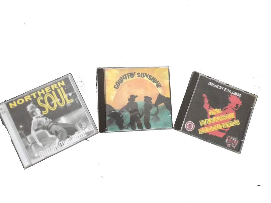
This image below is of the 3 CD Covers that I have created for different genres of music and in different media.