Research Artwork Techniques
in existing CD Artwork
in existing CD Artwork

|

|
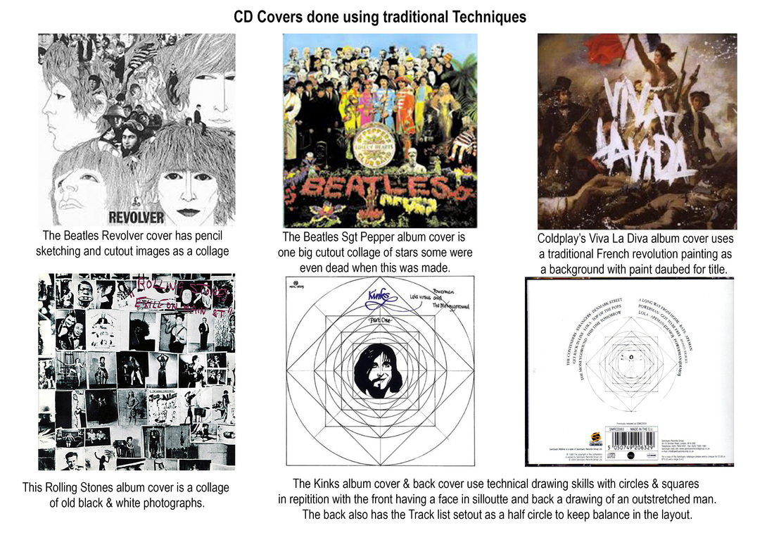
The two Cd covers that I have chosen here are Vector images done in Adobe illustrator and both only use three colours: Red, Black & White. Both the covers are very eye catching and would draw their followers to them on the CD rack.
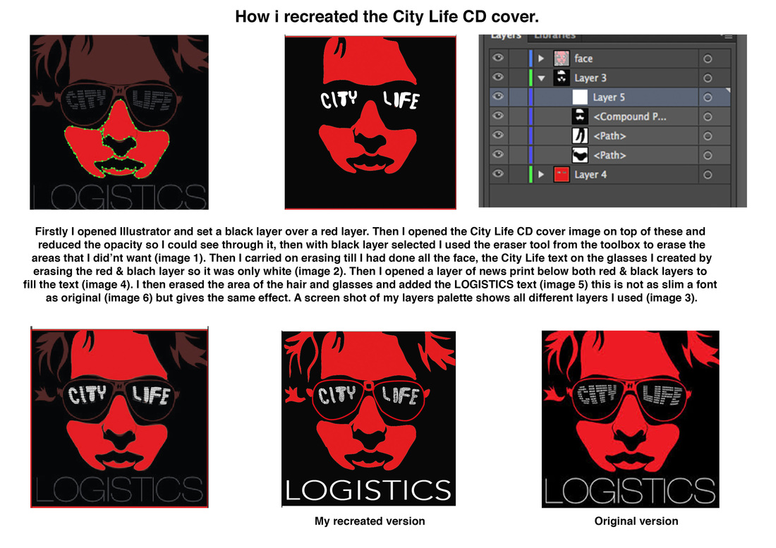
The Green day cover uses a bold sans serif font in a stencil style in both red & white using both upper & lowercase letters, while the City Life cover uses a light slim white sans serif font for the LOGISTICS in white & a freestyle custom font for CITY LIFE all the text in this design is uppercase. These two CD covers are for Rock Bands so they are hard hitting and in your face.
Adobe illustrator was used in these designs,
The City Life design would have been set out as two layers with a black layer over a red layer. An image of a face would have been put over the City Life design and set as a template so you could see through it, then with the eraser tool you can delete the black layer as required. Once you have your basic shapes erased from the black layer you can alter the lines with the convert anchor point tool to make your selections the way you want to look you must be sure the required layer you are working on is selected in the layers palette.
The Green Day design would be done different to City Life it would be done freehand and not with a template to follow with only a black layer and then add your shapes. This would be done with the pen tool to create your shapes on top of your black background and with the shape selected add a fill the colour you require in this case red or white. To keep your colours consistent you can use the eyedropper tool, once you have your shape with colour fill make another shape with no fill and with this shape selected get the eyedropper tool and click on your shape with colour fill and new shape will have same colour.
Both these works have been created digitally, Adobe illustrator would have been used to create these artworks. I think that I have described the process used in these works (above & below) and showed that I can create this type of artwork (below). The advantage of using illustrator for this instead of traditional paint, is that you get a cleaner image, there is no mess and you can adjust each layer as required. The tools used in illustrator would be the eraser tool and maybe the pen tool, anchor point tool & convert anchor point tool. the layers palette is important here also and to make sure you have the correct layer selected. I like the process used in these artworks because it it easy to use and you can easily rectify any mistakes with your edit option. You can see that these artworks are done digitally because they are so crisp and clear with good definition to the colours. You could do a traditional version of this with paint but then you are waiting for things to dry and the text would be difficult. Digitally you are able to print off a copy to proof then do minor adjustments if required in illustrator.
Both These artworks are for rock bands and I think that this is conveyed in the colours used and the subject matter, hard hitting and in your face. In the City Life design there is a sense of mystery and this will create a mood to attract their fans. The Green Day design how ever uses the same colours but conveys anger, anarchy and defiance with the bloody grenade in the clenched fist. both artworks will attract their intended audiences and draw them to the CD's on the shelf. The audience for these CD's would be your rock fans of many ages from 16 to 60 and even more.

|

|
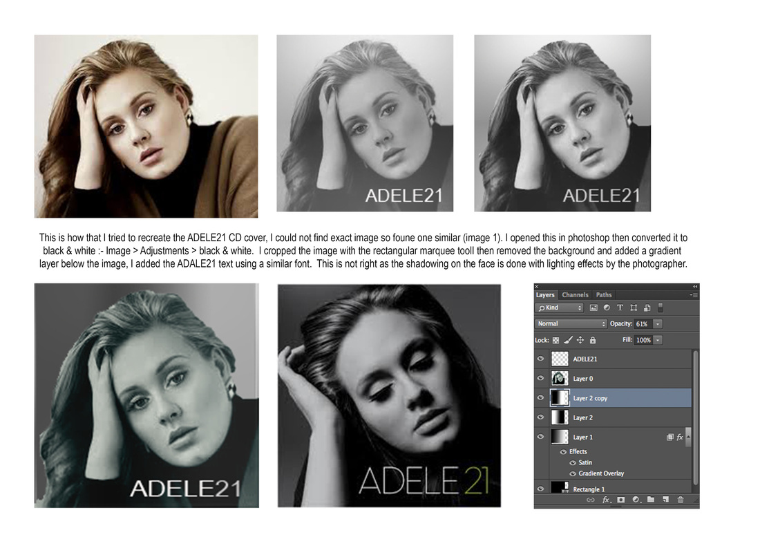
The two CD covers that I have chosen here ART BLAKEY and ADELE 21 have photos on them so the artwork is in pixels so was probably created in Adobe photoshop. Both the covers images are in black & white with plain backgrounds, while the ART BLAKEY design has introduced some colour with the red text. The text in this cover which is white & red is in a bold sans serif font using all uppercase letters, While ADELE 21 has a light stroke large sans serif font also in uppercase letters. Both of these covers are for easy listening/jazz and give that calm relaxed feel.
Both these CD covers have been done digitally, probably using the same process. I have tried to recreate the ADELE21 cover above in photoshop bur the image is not the same so this is down to photographers lighting techniques. Both covers are black & white I do not think that you would be able to recreate these images traditionally as they are so crisp and clear. The advantage of doing this digitally is that it can all be done on the computer where you can change the contrast lighting effects and so on then add the text. I like the dark somber look created in both the artworks it gives a sense of calm and peacefulness. Yes you can definatly see that these work have been created digitally as they are both pixel images and was meant to look like this. Photoshop is a great software for this type of work as you can see the effects there and then and if it's not correct you can change it, it gives great flexibility to your work.
The artist/designer of both these works are trying to portray a Smooth, Calm, Soothing atmosphere very soulful both of them. The colours used enhance the design for their target audience, that is the soul/jaz listener of all ages.

|

|
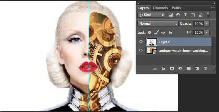
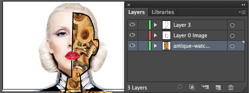
Above I have recreated a version of the Christine Aguilera CD cover image, the left image is in photoshop where I opened the face image then removed the area of the face I did not want with the eraser tool. Then opened the image of clock workings and placed this below the face image in my layers palette this then only shows in the area of the face that has been deleted. I then opened this image in illustrator to add a stroke around the clock working side of the face with the pen tool and increased it's size to 2pt. This is not the same as the original but is another way to reproduce this image.
The two CD covers that I have chosen here to portray mixed media are for completely different styles of music.
The Christine Aguilera cover has half her face as a photograph (pixels) and half as a vector robot, the album is called Bi-on-ic and the artwork shows her as a bionic woman. The artwork is set on a plain white background and is very eye catching. Christine has a very wide fan base and I think this would appeal to them. Sexy yet robotic the rock chick robot. The text in the design is also very good with her name being done in a font that looks like dripping paint in what looks like a Russian style serif font. Upper and lowercase letters have been used and different colours of first (black) and last (red) name.
The Christine Aguilera design would have been done in Adobe illustrator, firstly the image would have been opened, this would already have the white background. The pen tool would have been used to make the shape to the righthand side of her face, then all the cogs, wires and dials would have been put into this shape. These would have been created with the pen tool & shape tool to create the circles for the cogs, gradients have been used here to create depth/shadow and highlights a black outline is evident. Another way to do it would be to have a layer with the robot cogs and workings underneath the image of Christine and just delete the required area with the eraser tool. The text would have been put in the design with the text tool, then a dripping paint effect would have been added, this could be done with the pen tool to make the shape then different colour added as required.
With the Christine Aguilera artwork I have recreated my own version of this using photoshop (see images above) and illustrator, this is not an exact copy but just to show one technique you could use to create this. I first opened an image of Christine in photoshop and deleted the part of the face I did not need with the eraser tool from the tool box, then opened the clock workings image and placed it below the Christine image so you can see it through the deleted part of the face. I then opened this image in illustrator and with my pen tool done a black stroke with no fill around the deleted part of the face, I curved the stroke with the convert anchor point tool which you find in the pen tool sub section, click your cursor on anchor point required and drag one way or the other and you can see the path change to your required shape.
The original artwork the mechanical side of her face could have been done in illustrator using the pen tool, shape tool and adding colour and gradients to the work to give depth and definition. This could have been done traditionally but been very time consuming and messy while waiting for different areas of paint to dry. This artwork along with the BIONIC title of the CD go together well and would draw their intended audience to it in the stores.
The designer of this artwork has portrayed a sense of mystery, and a look into the future like a Cyborg figure. The design is fresh and clear and the artwork represents the CD title BIONIC, it is like she has been rebuilt with mechanical parts. This artwork provokes the audience into thinking that robots will one day exist. The atmosphere that it portrays is of life in the future. The digital imagery on the right side of the face uses Line, shape & depth to build the bionic feel. The colour in the artwork is good with the plain white background, the red lips bring some colour into the layout along with the colours in the mechanical side of the face. The text also brings colour into the layout and the dripping paint effect works well in that it gives it depth. The image of the face in the design has a Vacant, vague yet sexy expression that is not quite alive.
The other cover for Victor Essiet & The Mandators is for the Regge genre of music and uses a vector background in the Regge colours of Red, Yellow, Green & Black with a photograph (pixel) image on top. The text also uses Yellow & White this makes it standout in the design, the font used is like a handwritten sans serif style mostly in all uppercase. This design will appeal to the Regge fans and is bright and colourful just like the music.
The Victor Essiet design would mostly be done in illustrator as well, the photo image would have been opened in photoshop to remove the background. This can be done in a few ways: the eraser tool, magic eraser tool, lasso tool and magnetic lasso tool can all do this. With the magic eraser if the background is all one colour just click on to it and it is deleted, this may leave your image with a jagged edge. The magnetic lasso tool will select an area when you click on the edge of an object and then move your cursor around the shape it drops anchor points to your image, then select that area and delete the rest. The background in this design has a lot of different shapes made with the pentool with different colours also some have gradients this is done with the gradient tool.. There is also graffiti/airbrush style paint effects. The text also brings colour into the design with the bold yellow & white letters, this cover is very colourful just like Jamaica where the Regge music comes from.
This artwork was created digitally. The design is an explosion of colour with both vector and pixel imagery in it. The main image of Victor shows him as a cool dude with a swagger about him. This work represents what Regge music is all about Bright, Colourful and in your face. The vector artwork in this design gives the feel of urban London with the train image this is also a connection to the CD title Freedom Train, The barbed wire is also portraying urban life and could also be a flash back to the Jamaican slave trade and oppression, with the street sign post pointing the way to freedom. This could also be an echo to his life in Jamaica and the Regge music was his freedom train to escape. This artwork is Bold, Brash and shows the free spirit attitude of the Regge scene. Photoshop would have been used to take the photo image from it's background, this image shows a Free, Confident Black Jamaican man who can go where he wants when he wants and the rest done by vector images in illustrator. This work would be difficult to do traditionally so digitally is the best way forward. The layout in this design is quite busy but it works, lots going on with the colour and imagery.
The two CD artworks above have been created digitally, This would have been done in both Adobe photoshop and illustrator. I think that they would be very difficult to create traditionally as both designs use a photo image as the main feature. Both artworks can be seen as done digitally this is evident in that both use photograph images (pixels) and both images have vector work in them. So photoshop and illustrator would have been used.
