Restaurant Branding
Logo & Menu Design
A new restaurant will be launched and you are asked to create the branding of the restaurant. Your task is to design a logo for the restaurant that looks polished and professional.
The Chicago Sausage house
The Chicago Sausage House is a well established restaurant / pub / bistro specialising in homemade sausages and fine ales. They are looking for a new logo to role out throughout the venue and want something fun, friendly, hand crafted and well designed. They want something with a scripted and bespoke feel to it but apart form that are giving the designer complete creative freedom.
Target Audience: Young parents, students, creatives.
Task 1 Planning
I am going to be creating a logo for a Chicago Sausage house, I will be exploring the internet for logo ideas and creating mindmaps & moodboards of the sort of images that I would like to create. My assignment brief has already told me that this is a well established restaurant / pub / bistro specialising in homemade sausages and fine ales. And the target audience is Young parents, students, creatives. I shall be keeping a work log on each task in the Brief with Screenshots, Sketches, thumbnail sketches and notes to keep me on track so that I can achieve my goals and meet time lines.
PROJECT BRIEF
Background: Give a brief description of the reasoning behind the brief
This Brief is for a Chicago Sausage House that is a well established restaurant / pub / bistro specialising in homemade sausages and fine ales. My goal is to design a logo that will stand out from the crowd and bring customers into the establishment. This logo will be in a Retro style and show that the Bar is a fun/lively place for all ages.
Target Audience: Exactly who are you aiming at? Think about gender, age range, interests, lifestyle and cultural or social background. Is the product aimed at groups or individuals?
The target audience is Young parents, students, creatives of any gender and a age range that can vary so much from young to the young at heart. The life style of the customers could be free fast living, fun and easy going. The bar is aimed at groups of friends or families to have a fun carefree night out.
Project Goals: What do you hope to achieve from your project? What message needs to be communicated? To sell or offer something, to persuade, inform, educate, entertain, create a commercial identity or brand image, raise awareness, illustrate, attract attention, or impress?
With this project I hope to attract customers to the bar, with a message that the bar is a fun and friendly place to come and meet & eat. This will be trying to sell the bars fine food & ales to the target audience. I will be creating the bars commercial identity that will go on all their merchandise, menu's, letterheads & media advertisements. I will need to attract attention and raise awareness to the bar.
Mandatory requirements: Things that must happen i.e. Must use Direct mail, must have recycle logo, advertising campaign etc.
This logo will go on menu's for direct mail, It will have a Recycle logo so be on recyclable paper and will front the bars advertising campaign.
Tone of voice: Are you going to shout your message? Shock me? Persuade me?
My message with this logo will shout out the bars best features, Great food & ales and that it is a fun & friendly place to meet & eat.
What style of visual message is appropriate?
Comic, solemn, simple, detailed, funky, sophisticated, subtle, stylish, low-tech/high-tech, arty, hardhitting, discrete, high impact, street style, business-like, retro?
The visual message that I will be trying to put across is that the bar is Stylish yet fun, this will have a retro style.
Considerations: Are there things that have to be taken into consideration i.e. competitor designs, small budget, environment etc. Also think about where will it be displayed? Will this affect its design, weight, properties? Can it go outside? Is it waterproof?
This design will have to be distinctive as this is a very competitive market, it needs to be recognisable from it's competitors and attract customers to the bar. The design will be transferable to all materials so will be outside on bar signs and also on bar staff uniforms.
Deliverables: Tell me exactly what you are going to produce i.e. logo, flyer, postcard or a combination of items etc
I will be creating a logo that will be seen on all the bars merchandise, menu, letterhead, Uniforms and will be also transferable to multi-media for advertising on the net,TV and in print flyers ect.
Task 2 Research
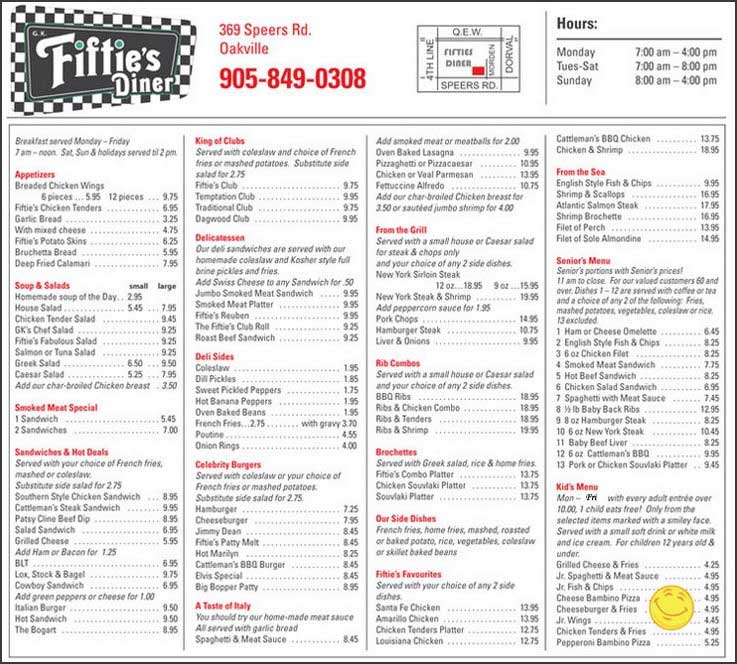
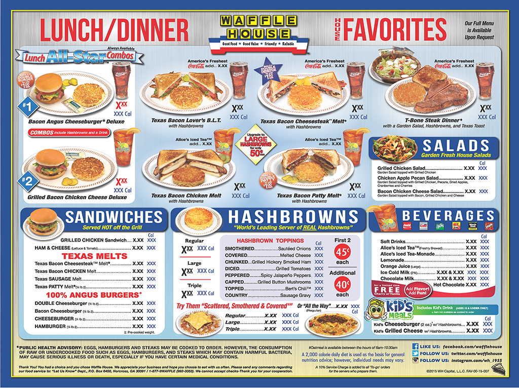
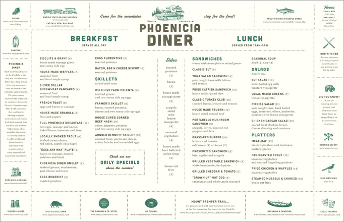
In my research for this task i have looked on the internet for Chicago sausage house logos to compare, I have also looked at images of the restaurants interiors & their menu's to get a feel for the brief. I have noticed that a lot of the places are Italian restaurants and have the colours of the Italian flag incorporated in their themes.
My target audience is:- Young parents, students, creatives of any gender and age range that can vary so much from young to the young at heart. The life style of the customers could be free, fast living, fun and easy going. The bar is aimed at groups of friends or families to have a fun carefree night out to meet friends in a relaxed atmosphere. the restaurant will be friendly and welcoming to all ages, and have a relaxed meal and drink, chat in a chilled atmosphere.
The competition for this restaurant will be other sausage houses, pizza restaurants, burger joints other fast food establishments.
The restaurant will be a sausage house so most of the food will be sausage, hot dogs, brautwurst, maybe some burgers & pizza all Italian inspired.
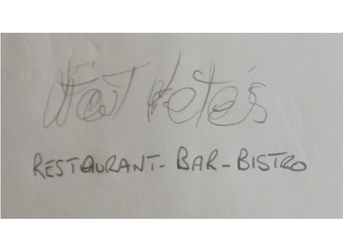
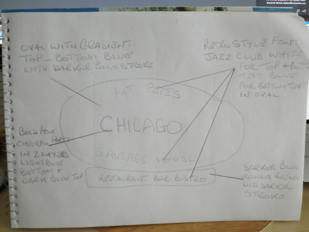
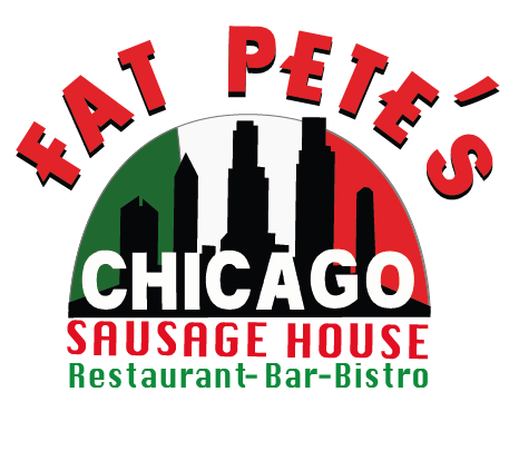
The wording for my logo is going to be FAT PETE'S, CHICAGO, Sausage House, Restaurant-Bar-Bistro.
I will de using Bold text fonts in two styles, I am going for a retro yet stylish feel for my logo. I am going for a fresh uncluttered logo
The colours that I will be using are Green, White and Red. The colours of the Italian flag as it is an Italian restaurant. There is a large Italian community in Chicago so this is our target audience also.
I am going to be creating a logo for a Chicago Sausage house, I will be exploring the internet for logo ideas and creating mindmaps & moodboards of the sort of images that I would like to create. My assignment brief has already told me that this is a well established restaurant / pub / bistro specialising in homemade sausages and fine ales. And the target audience is Young parents, students, creatives. I shall be keeping a work log on each task in the Brief with Screenshots, Sketches, thumbnail sketches and notes to keep me on track so that I can achieve my goals and meet time lines.
PROJECT BRIEF
Background: Give a brief description of the reasoning behind the brief
This Brief is for a Chicago Sausage House that is a well established restaurant / pub / bistro specialising in homemade sausages and fine ales. My goal is to design a logo that will stand out from the crowd and bring customers into the establishment. This logo will be in a Retro style and show that the Bar is a fun/lively place for all ages.
Target Audience: Exactly who are you aiming at? Think about gender, age range, interests, lifestyle and cultural or social background. Is the product aimed at groups or individuals?
The target audience is Young parents, students, creatives of any gender and a age range that can vary so much from young to the young at heart. The life style of the customers could be free fast living, fun and easy going. The bar is aimed at groups of friends or families to have a fun carefree night out.
Project Goals: What do you hope to achieve from your project? What message needs to be communicated? To sell or offer something, to persuade, inform, educate, entertain, create a commercial identity or brand image, raise awareness, illustrate, attract attention, or impress?
With this project I hope to attract customers to the bar, with a message that the bar is a fun and friendly place to come and meet & eat. This will be trying to sell the bars fine food & ales to the target audience. I will be creating the bars commercial identity that will go on all their merchandise, menu's, letterheads & media advertisements. I will need to attract attention and raise awareness to the bar.
Mandatory requirements: Things that must happen i.e. Must use Direct mail, must have recycle logo, advertising campaign etc.
This logo will go on menu's for direct mail, It will have a Recycle logo so be on recyclable paper and will front the bars advertising campaign.
Tone of voice: Are you going to shout your message? Shock me? Persuade me?
My message with this logo will shout out the bars best features, Great food & ales and that it is a fun & friendly place to meet & eat.
What style of visual message is appropriate?
Comic, solemn, simple, detailed, funky, sophisticated, subtle, stylish, low-tech/high-tech, arty, hardhitting, discrete, high impact, street style, business-like, retro?
The visual message that I will be trying to put across is that the bar is Stylish yet fun, this will have a retro style.
Considerations: Are there things that have to be taken into consideration i.e. competitor designs, small budget, environment etc. Also think about where will it be displayed? Will this affect its design, weight, properties? Can it go outside? Is it waterproof?
This design will have to be distinctive as this is a very competitive market, it needs to be recognisable from it's competitors and attract customers to the bar. The design will be transferable to all materials so will be outside on bar signs and also on bar staff uniforms.
Deliverables: Tell me exactly what you are going to produce i.e. logo, flyer, postcard or a combination of items etc
I will be creating a logo that will be seen on all the bars merchandise, menu, letterhead, Uniforms and will be also transferable to multi-media for advertising on the net,TV and in print flyers ect.
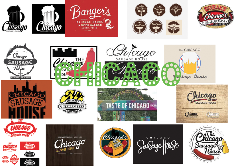
Task 2 Research
In my research for this task i have looked on the internet for Chicago sausage house logos to compare, I have also looked at images of the restaurants interiors & their menu's to get a feel for the brief. I have noticed that a lot of the places are Italian restaurants and have the colours of the Italian flag incorporated in their themes.
My target audience is:- Young parents, students, creatives of any gender and age range that can vary so much from young to the young at heart. The life style of the customers could be free, fast living, fun and easy going. The bar is aimed at groups of friends or families to have a fun carefree night out to meet friends in a relaxed atmosphere. the restaurant will be friendly and welcoming to all ages, and have a relaxed meal and drink, chat in a chilled atmosphere.
The competition for this restaurant will be other sausage houses, pizza restaurants, burger joints other fast food establishments.
The restaurant will be a sausage house so most of the food will be sausage, hot dogs, brautwurst, maybe some burgers & pizza all Italian inspired.
The wording for my logo is going to be FAT PETE'S, CHICAGO, Sausage House, Restaurant-Bar-Bistro.
I will de using Bold text fonts in two styles, I am going for a retro yet stylish feel for my logo. I am going for a fresh uncluttered logo
The colours that I will be using are Green, White and Red. The colours of the Italian flag as it is an Italian restaurant. There is a large Italian community in Chicago so this is our target audience also.
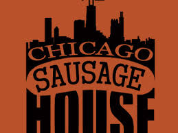
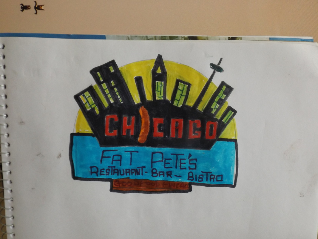
This logo is very good only using two colours, the Chicago skyline in black with the word "Chicago" in it is stylish. The Sausage shape in the centre is also very good with the text inside it. The bottom of logo is the word House and it all knits in together very well. All of this is set on a one colour background and works very well.
|

I like this logo for it's simple layout. The beer top shape is good and I like the font used. There is a sausage & mustard bottle image that add colour and put the message across. This logo is fresh and interesting and will work to attract it's target audience.
|
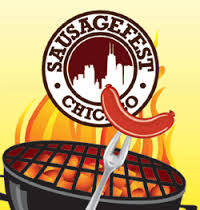
This is another logo that I like and is different from the other two as it uses a B.B.Q. image with flames. It has a Chicago skyline image as in the first logo and the sausage image similar to the second logo.
This logo is basic but effective and you would know what it was for when you seen it. |
Task 3 - Brainstorm with Mindmaps
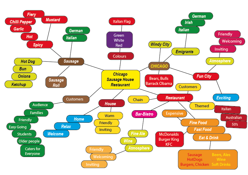
Task 4 Moodboards
The mood board above gives a feel of the Chicago Sausage House interior, the Atmosphere and Style of the Restaurant.
This Moodboard above looks at different styles of Sausage House Logos
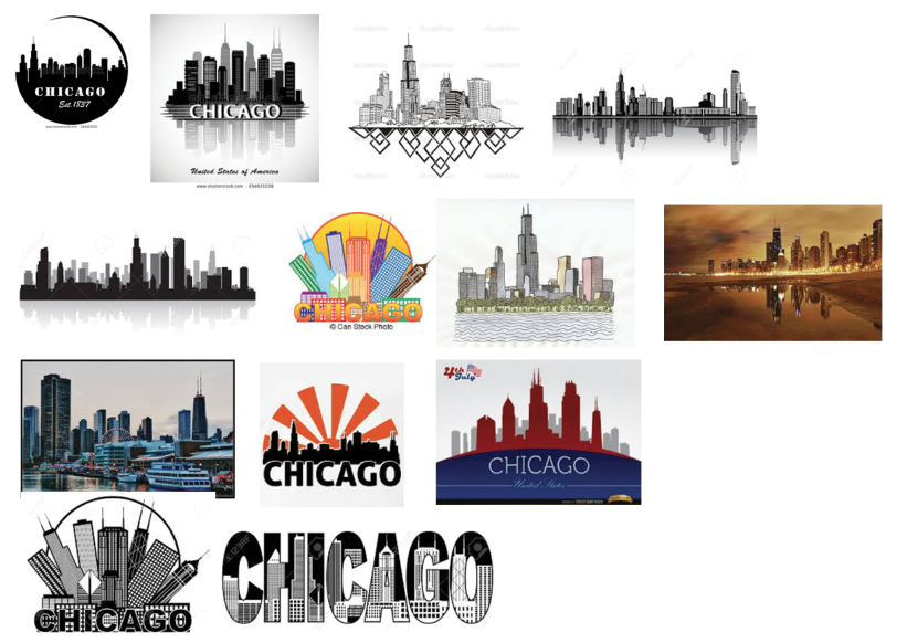
The moodboard above is for the look of Chicago.
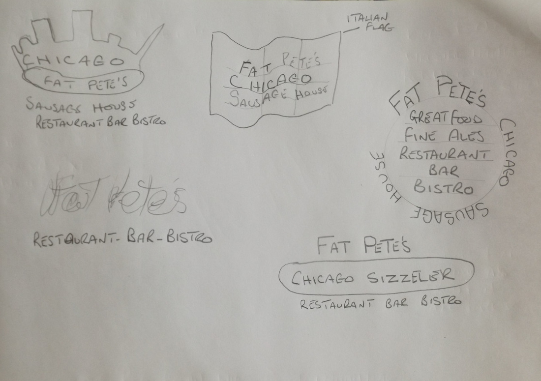
Task 5 - Brainstorm with Doodles & Task 6 - Thumbnails
Brainstorming with doodles is a great way of firstly getting your ideas onto paper to see what they look like. This will enable me to look at many different ideas for my logo project and see what works and what doesn't, I may even be abel to mix ideas from different sketches/doodles in my final layout.
|
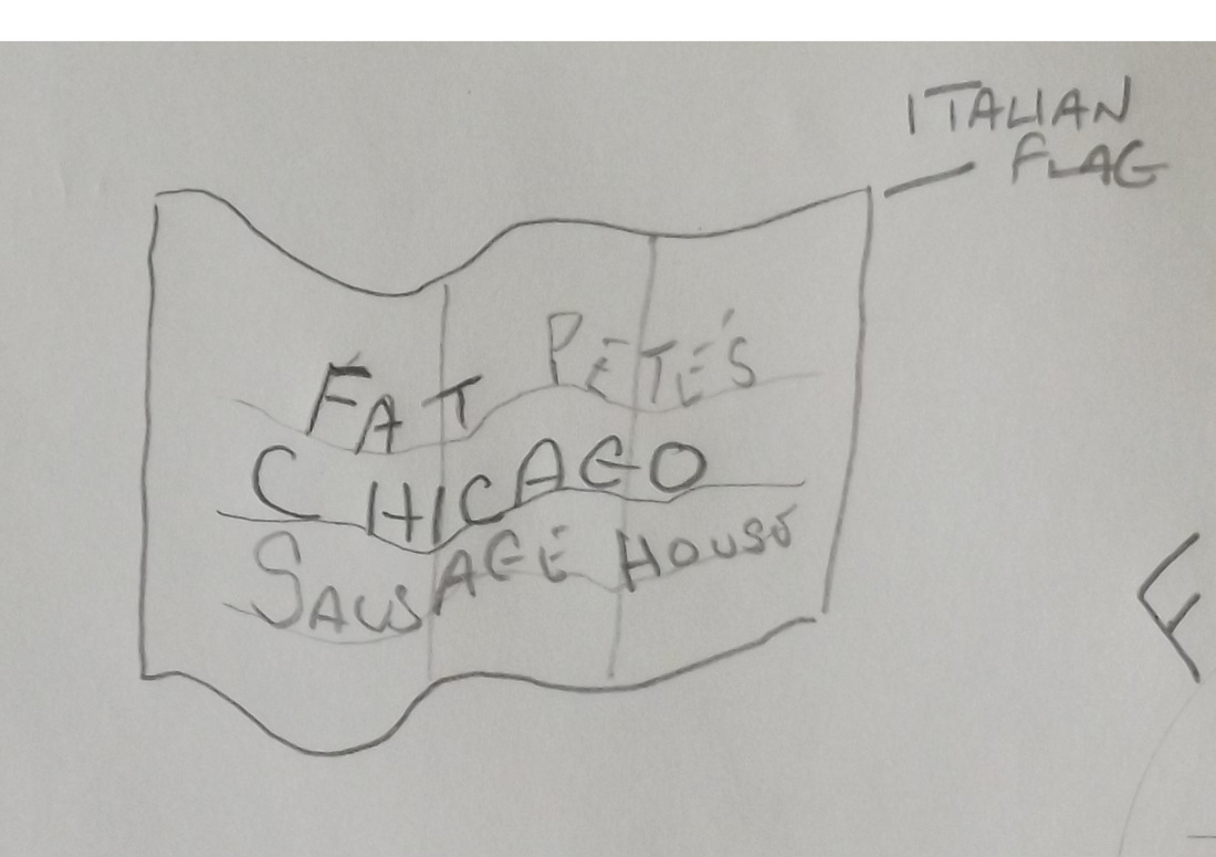
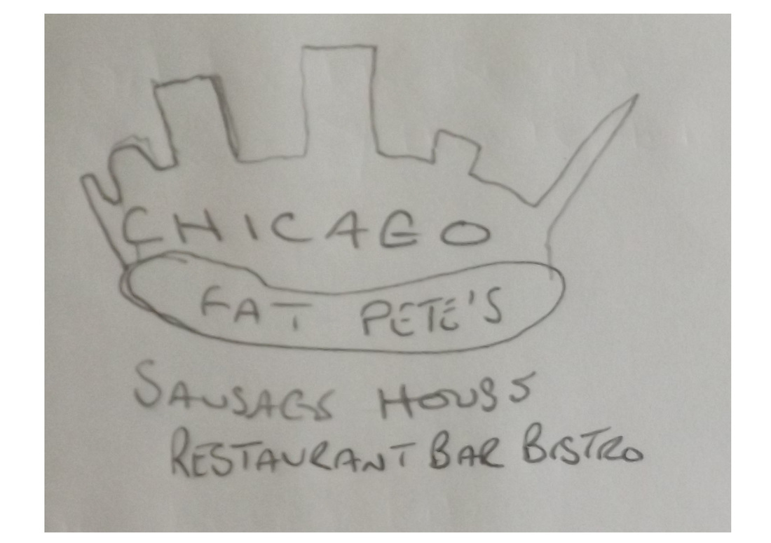
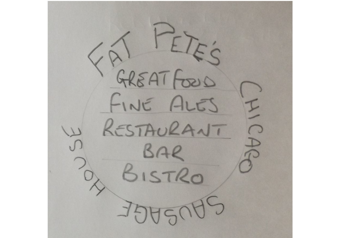
Here are some sketches of Ideas that I have had for my sausage house logo.
|
|
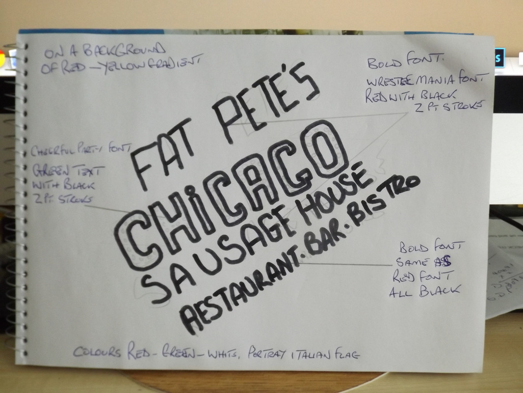
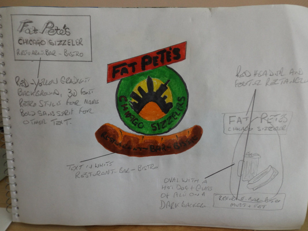
Photo above has three ideas that I have been thinking of for this project
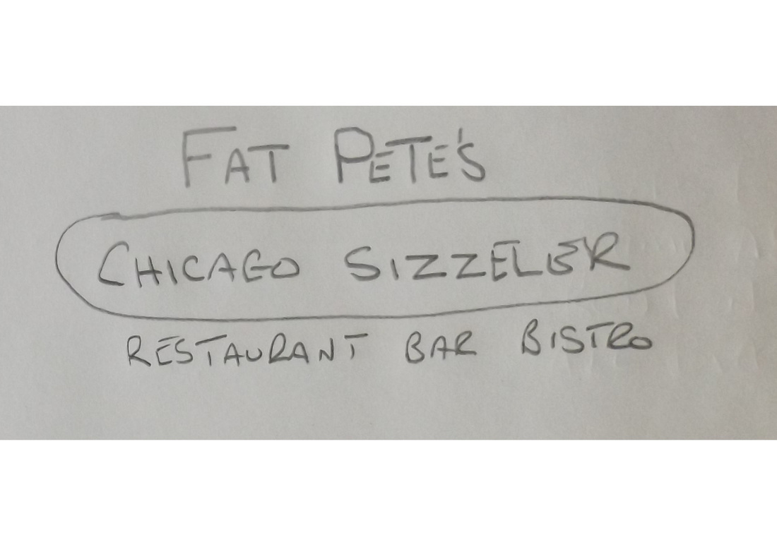
Another idea for logo above I think it has to many colours once you look into it.
|
|
Above there are two more ideas for my logo these are simple designs less cluttered
Task 7 - Develop your idea further using SCAMPER Technique
- Substitute: Put one thing in place of another. Don’t just stick to logical choices; choose unlikely, silly or even outrageous substitutes.
- Combine: Mix different ingredients together in fresh, inventive ways. Again, don’t be constrained by logic.
- Adapt: Alter one, several or all of the variables. Change the functions so one aspect has a different role.
- Modify: Increase or reduce features. Change size, shape or function. Feel free to play with the outcomes.
- Put to another use: Create different functions for everything. Consider how you can use each variable differently.
- Eliminate: Reduce, simplify or remove elements. Does it still work? Can you think of different applications as a result of the changes?
- Reverse: Take the product or concept and stand it on its head. What happens when you consider it from this new perspective?

Task 8 - Experiment with Graphic Ideas - digital implementation
The Slideshow below shows my development Ideas for my logo
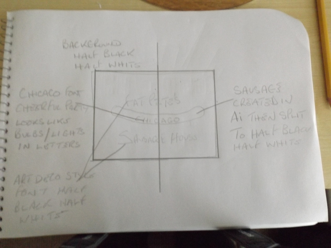
The images below are my logo still in project form, I changed the skyscraper outline from deep red to black I did this to create impact in the design at a later stage I removed the grey skyscraper image & the green box behind bottom text to simplify the design. I have sized the logo for different items Letterhead, Menu, Business card and the font that I used get blurred the smaller it goes.
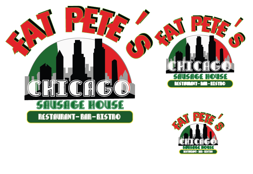
The images below I have changed the Font style on bottom words and changed the colour around so it goes with the Italian theme I changed the font style to make it look bold & clean but changed it again later as I did not think it looked right for the logo. The font is readable now even in its smallest form.
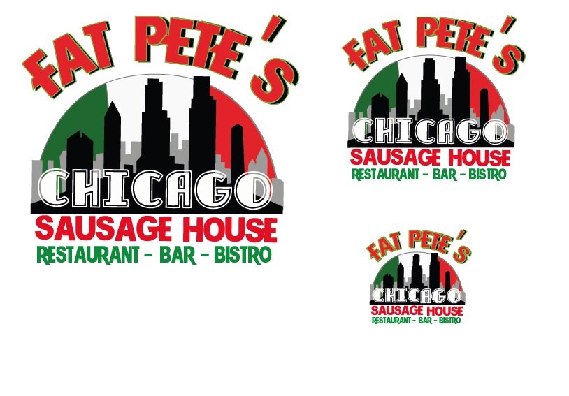
On the images I have removed the grey skyscraper background to simplify the design and changed the CHICAGO font style to the same font as other text to bring it together better, I also added some tracking to FAT PETE'S header font to space letters out to make this easier to read in all sizing of the logo.
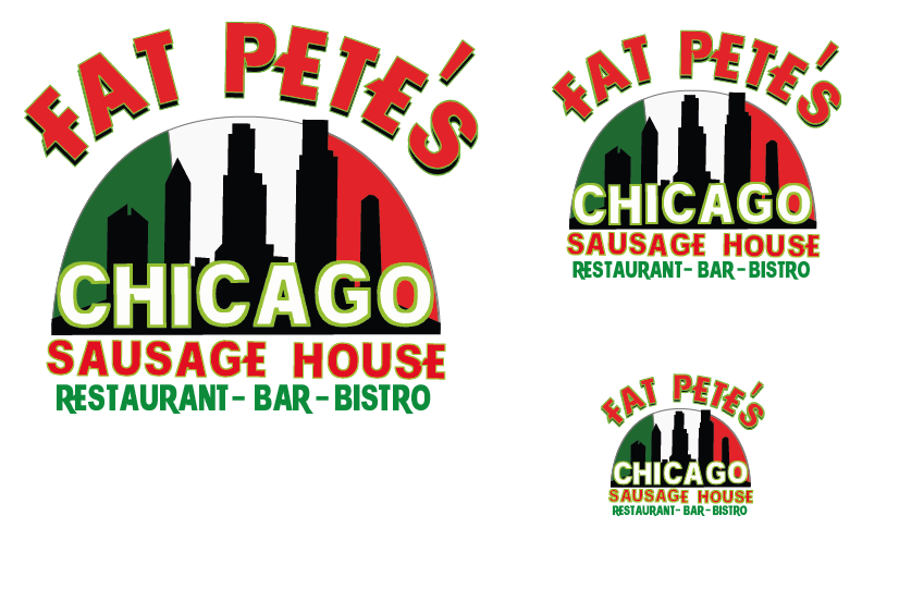
The logo images below I have changed the font for SAUSAGE HOUSE & Restaurant-Bar-Bistro, the left image SAUSAGE HOUSE & R-B-B font is not strong enough while the same text in right image is bolder & cleaner. The left Image I used a Font called Silom but didn't Look righ so in the right image I used Ariel Black. I also have taken the Green stroke that I had on some of the text off, as this was not needed and it gives the text a fresher/cleaner look.
|

|
The Slideshow Below shows all my changes to my logo, Text & Images
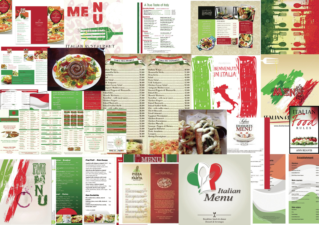
Moodboard for my Italian theme Restaurant Menu
Organic Farm Shop Menu/Branding Evaluation
Menu Design
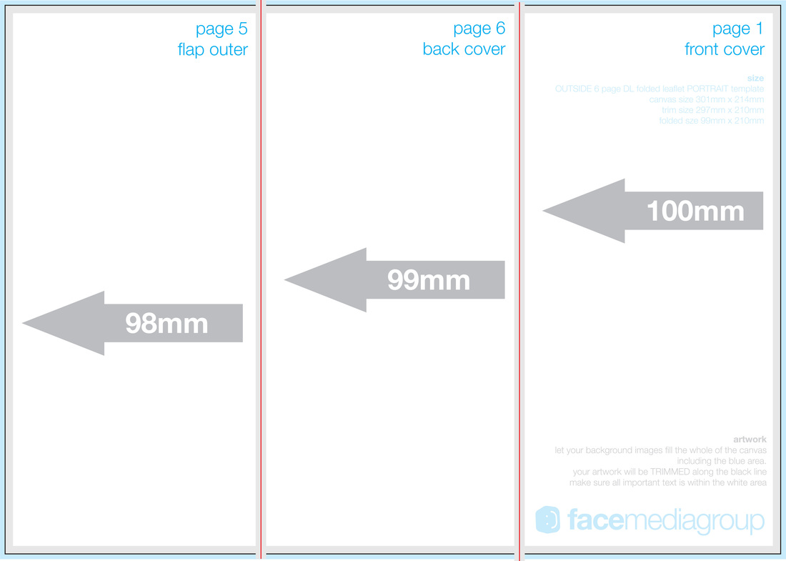
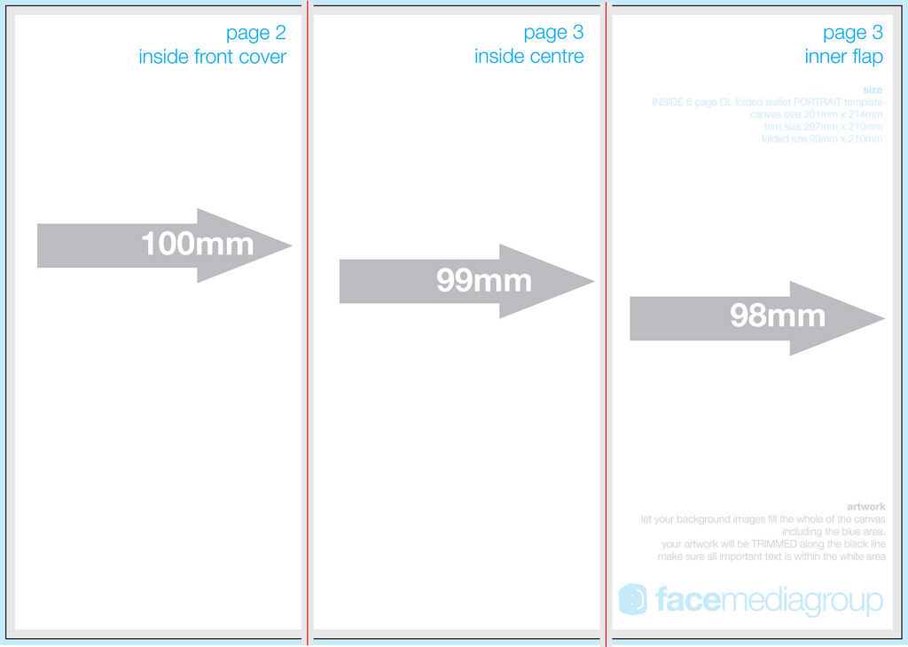
A4 Tri-Fold
A4 Tri-Fold
|
|
The dimensions for an A4 size Tri-Fold menu are from left hand side 100 mm to first fold, 99 mm to next fold this will leave 98 mm to the right hand edge. Above you can see images of the sizes for the outside & inside of menu. I have decided to do a table menu for my assignment A3 printed both sides. Below you can see my layout grid for this design.
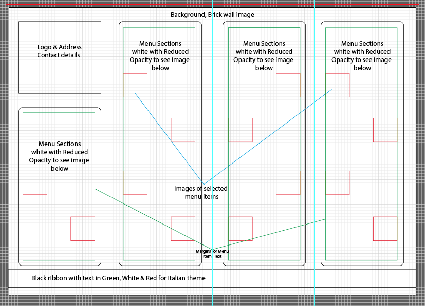
The size will be H 297 mm X W 420 mm, Each section will be spaced out using the grid for guidence
Menu Design using Logo That I designed
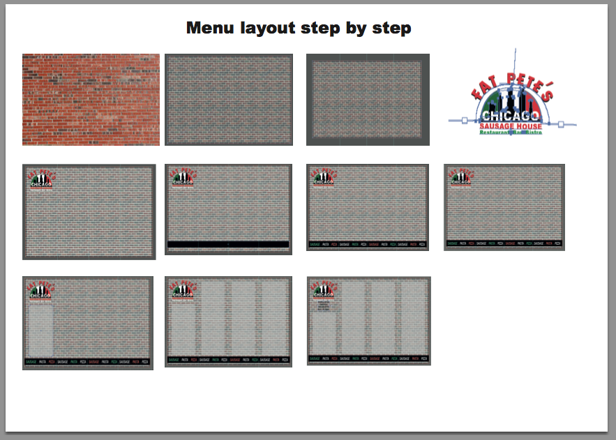
Slideshow of my Menu Layout Step-by-Step
There are a lot of screen shots (47) at the end of this slide show that I have not put individual notes on as a lot of them are lust alignment issues. Some are of images I had taken out as layout looked cluttered and white space is important in a design.
This slideshow above is all to do with alignment issues a simple tweak here and there, to create more whitespace in the layout I also removed one of the fish dishes this gave more room for the spacing around the sub-headings and a cleaner, clearer look to the layout. I also removed one of the images from the Pizza section in the menu front layout, this also created more space and a better balance in layout.
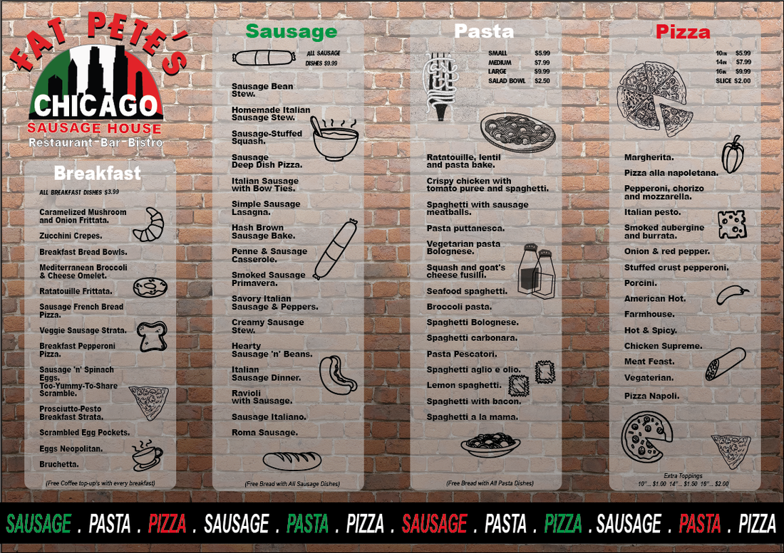
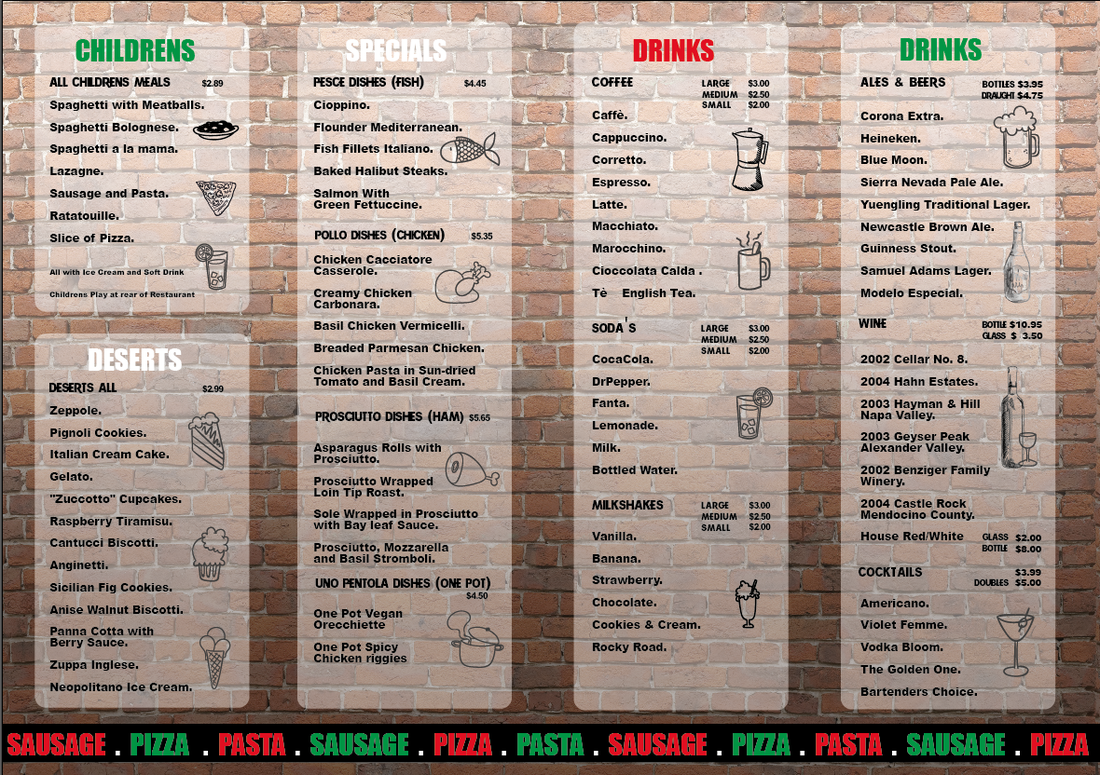
FINAL MENU DESIGN
Front
Front
Back
End of Project Self Evaluation
The most successful aspect in this is the end result, I have worked very hard on this project and think the final layout speaks for it's self. It's bright, Bold and easy to follow. Just what you would want in a menu for a restaurant.
I have learnt that simplicity is the best way to go, White Space is important in a layout and that symmetry and balance are also important.
The technique I would change in this particular design layout is I would use different software to compose the design. I used Adobe illustrator, this is great for graphics and images but not so good for the text. I found it difficult to align some of it and with hind sight I should have used adobe indesign this software is more flexible with text.
I think that most of the design went well, some more than others. I started with my Planning and Project brief, I then done my research and brainstorming with mind maps. I done my moodboards and doodles then developed further using the S.C.A.M.P.E.R. Technique which has all been recorded on my web site and all hard copies kept for reference. So all in all things went well.
My biggest weakness is trying to run before I can walk. In so much as I enjoy the practical work on the computer rather than the research and study work. This time I had to do everything correctly in the right order.
My time on the whole for this has been managed well, I had a few weeks off when I moved flat and a short period that I could not get motivated but I got through that and spent most of the day Tuesdays and Thursdays on-line with my tutor.
My research was very useful in this design, I first researched Chicago sausage house, the style of them interiors and exteriors. This was very informative and helped me with my ideas for the design.
I am very happy with my computing skills, everyone can always learn more as new software becomes available.
Personally I think that my work is to a high standard, there is always room for improvement and I take any negative feedback onboard and try to improve my skills.
I am a child of the 50's and like a retro style, I have tried to give this Menu layout a 50's retro style yet still get the atmosphere of the restaurant across in the layout, relaxed and friendly.
I do feel that I have progressed as a designer, I am more confident and outgoing in my work yet not to confident to be told that someone dose not like my work. We are all different and like different things.
I can do better with my research, and planning I think. I get an idea in my head and want to run with it. I want to get on the computer and start to produce something I can see instead of taking my time and planning my design.
Evaluation Unit 4 Communication in Art & Design
|
|

|
|
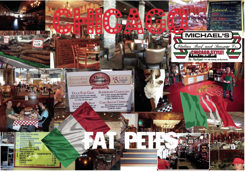
The above images are where I got my ideas for my Logo and Menu from.
There are lots of ways that media can convey ideas and meaning in art, artist's/designers must not express an idea but an emotion. The idea, the meaning, comes from the artist. the object of a work of art is to induce feelings in the viewer, reader or listener. Graphic art using photo images or vectors is every where on your magazines you read to the cereal packets you use for breakfast, Artists paintings in Galleries the old masters and modern art together in one place, Collages in 3D are very common and bring an artists works to life, Sculptures be it an old sculpture or a modern day one they all bring different aspects to art, Drawing and sketching is how every designer should start a project after getting the design brief and studying the project. The use of different colours to portray mood IE:- RED for Hot, Fiery, Romantic. BLUE for Cold, Water, Ice, Chill. BLACK for Death, Dark, Somber. Different texture can bring differing effects to art IE:- Hard-Soft, Rough-Smooth, this all contributes into a Designers/Artists work. All the different software that you can use now on your Mac or Pc make the design process clean and tidy. You can see in my course work many different styles of this from Picasso's Collages to Andy Warhol's Popart. I have documented this in each section of my course.
My final design for Restaurant Identity, Logo and Menu was inspired by looking through lots of American diner logos and photos of american 50's diners. These were always bold colourful places that drew you into them with their neon signs and 50's art posters. They always had a lively atmosphere. I also looked at adverts for diners and at many restaurant websites. This helped me in deciding my layout design first for my logo then my menu. I wanted to do a 50's American Diner theme as I like the era and all things retro. I watched the T.V show “HappyDays” in the 70's with Arnold's diner, and I frequent American Diners myself when I can. I have seen menu layouts similar to this but not the same, my menu is a Table menu in A3 size double sided. Some restaurants use this format and I think they are clearer to understand.
The visual communication techniques that I used in this brief were, The use of colour in my logo along with shape, I researched logos and decided on this style. My logo colours were Green, White and Red as this is an Italian restaurant and they are the colours of Italian flag. I used a half moon shape to put my image into to incorporate the Italian flag and Chicago skyline image in black, this also gave me the shape for the restaurant name "FAT PETE'S" This gave my logo a retro look, just what I was aiming for. I used adobe illustrator to create this logo as it gave me flexibility in my design and I can always delete things that don't always work. The logo design is Bold, Bright and can be used in all sizes from Business card to Menu and Restaurant Signage It re-sizes well. The fonts used in logo and menu are consistent and bring balance and continuity to the layout. I used reduced opacity on the menu sections so you could see the brick wall background behind. The brick wall background was chosen as it gives the menu a rustic and homely look, this add's to the atmosphere of the restaurant it is how the interior walls of restaurant would be finished with black & white photos on them. The use of hand drawn vector items such as food and drink in the menu has worked well this brings balance into the layout. These vectors were used instead of photos of food (I tried photos of food and did not like the look) because I think they bring the design together and look less cluttered in the layout. The vectors give the design a friendly, family orientated look even the young children can recognise what the items are.
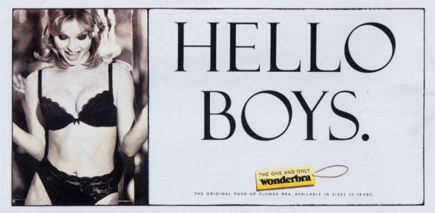
Visual styles can create different reaction in differing media, Say for instance in a cinema while watching a movie an image of food is flashed on screen cut into the film (subliminal advertising) this would be very hard to see but its there and would be taken in subconsciously and you would feel hungry if the restaurant logo was flashed it would be in the cinema audience minds and attract them to it. Billboard's are used for impact, large and very memorable who can forget the "Hello Boys" Wonder bra adverts. These will attract passing trade Motorists, Pedestrians. Magazine's tend to be aimed at a certain audience and can be great to get your product noticed. T.V advertising is very good to promote your products to, a commercial break in a prime time show will get across to millions in one hit. The introduction of Facebook brought advertising to a whole new wider audience and it is out there with the best advertisers today, with Facebook advertising you can get a response very quickly with people liking your page and messaging you for reservations. This is instant marketing and can be very advantageous.
The logo/menu will communicate well with it's target audience, in the very competitive restaurant market the logo will be noticed as it is distinctive and memorable. The logo will attract Italian Americans and also any other customer's with it's distinctive colours and art work.
There are lots of ways that media can convey ideas and meaning in art, artist's/designers must not express an idea but an emotion. The idea, the meaning, comes from the artist. the object of a work of art is to induce feelings in the viewer, reader or listener. Graphic art using photo images or vectors is every where on your magazines you read to the cereal packets you use for breakfast, Artists paintings in Galleries the old masters and modern art together in one place, Collages in 3D are very common and bring an artists works to life, Sculptures be it an old sculpture or a modern day one they all bring different aspects to art, Drawing and sketching is how every designer should start a project after getting the design brief and studying the project. The use of different colours to portray mood IE:- RED for Hot, Fiery, Romantic. BLUE for Cold, Water, Ice, Chill. BLACK for Death, Dark, Somber. Different texture can bring differing effects to art IE:- Hard-Soft, Rough-Smooth, this all contributes into a Designers/Artists work. All the different software that you can use now on your Mac or Pc make the design process clean and tidy. You can see in my course work many different styles of this from Picasso's Collages to Andy Warhol's Popart. I have documented this in each section of my course.
My final design for Restaurant Identity, Logo and Menu was inspired by looking through lots of American diner logos and photos of american 50's diners. These were always bold colourful places that drew you into them with their neon signs and 50's art posters. They always had a lively atmosphere. I also looked at adverts for diners and at many restaurant websites. This helped me in deciding my layout design first for my logo then my menu. I wanted to do a 50's American Diner theme as I like the era and all things retro. I watched the T.V show “HappyDays” in the 70's with Arnold's diner, and I frequent American Diners myself when I can. I have seen menu layouts similar to this but not the same, my menu is a Table menu in A3 size double sided. Some restaurants use this format and I think they are clearer to understand.
The visual communication techniques that I used in this brief were, The use of colour in my logo along with shape, I researched logos and decided on this style. My logo colours were Green, White and Red as this is an Italian restaurant and they are the colours of Italian flag. I used a half moon shape to put my image into to incorporate the Italian flag and Chicago skyline image in black, this also gave me the shape for the restaurant name "FAT PETE'S" This gave my logo a retro look, just what I was aiming for. I used adobe illustrator to create this logo as it gave me flexibility in my design and I can always delete things that don't always work. The logo design is Bold, Bright and can be used in all sizes from Business card to Menu and Restaurant Signage It re-sizes well. The fonts used in logo and menu are consistent and bring balance and continuity to the layout. I used reduced opacity on the menu sections so you could see the brick wall background behind. The brick wall background was chosen as it gives the menu a rustic and homely look, this add's to the atmosphere of the restaurant it is how the interior walls of restaurant would be finished with black & white photos on them. The use of hand drawn vector items such as food and drink in the menu has worked well this brings balance into the layout. These vectors were used instead of photos of food (I tried photos of food and did not like the look) because I think they bring the design together and look less cluttered in the layout. The vectors give the design a friendly, family orientated look even the young children can recognise what the items are.
Visual styles can create different reaction in differing media, Say for instance in a cinema while watching a movie an image of food is flashed on screen cut into the film (subliminal advertising) this would be very hard to see but its there and would be taken in subconsciously and you would feel hungry if the restaurant logo was flashed it would be in the cinema audience minds and attract them to it. Billboard's are used for impact, large and very memorable who can forget the "Hello Boys" Wonder bra adverts. These will attract passing trade Motorists, Pedestrians. Magazine's tend to be aimed at a certain audience and can be great to get your product noticed. T.V advertising is very good to promote your products to, a commercial break in a prime time show will get across to millions in one hit. The introduction of Facebook brought advertising to a whole new wider audience and it is out there with the best advertisers today, with Facebook advertising you can get a response very quickly with people liking your page and messaging you for reservations. This is instant marketing and can be very advantageous.
The logo/menu will communicate well with it's target audience, in the very competitive restaurant market the logo will be noticed as it is distinctive and memorable. The logo will attract Italian Americans and also any other customer's with it's distinctive colours and art work.
|
|
|
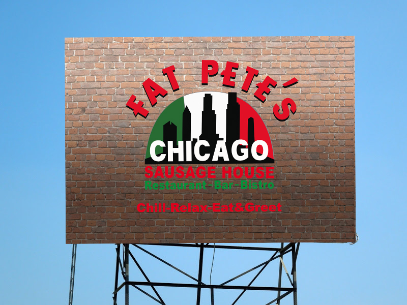
HOW THAT MY RESTAURANT LOGO
WOULD LOOK ON A BILLBOARD
I think that my finished campaign will be very good at communicating the brand identity to it's target audience, Italian Americans. It will also communicate with the people of Chicago in general, the Logo will be associated with a Chilled, Relaxing place to socialise with family for that special meal or just a relaxed catch up with friends. I have used the Italian flag as a feature and the Chicago skyline this gives the design a fresh yet still Retro look and the "FAT PETE'S" name curved around the design is bold and also a 50's retro style. I have used adobe illustrator to create this logo/menu and I think that the final results are very striking and visually memorable, the design would be comparable with other restaurant signage yet still individual and would stand out on it's own.
I have studied the client's brief in great detail, and researched the Chicago sausage house logo's that are available. I have created a large portfolio of ideas in moodboards, mindmaps and sketches, that show my development of my logo idea. My idea is unique and connected to it's target audience well. This logo is visually very good and has a retro/50's look about it. The logo is for an independent chain of Chicago Sausage House's that you can get a great Italian meal or just meet and chat with friends in a relaxed atmosphere. I have achieved this by using the colours of the Italian flag as a feature, this runs through the menu also, with the text being the same colours. The use of the Chicago skyline in black gives the logo depth and it is great visually. My final menu layout is visually good and will not be out of place in a restaurant.
