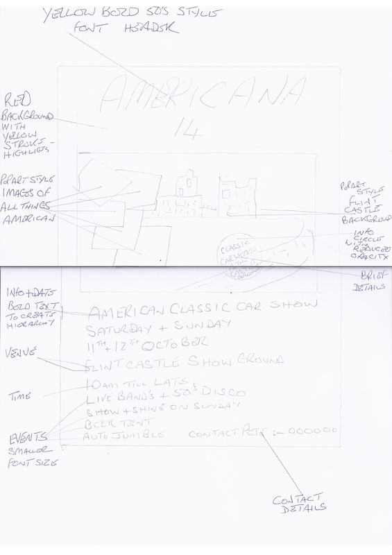
Exercise 4
Task 2
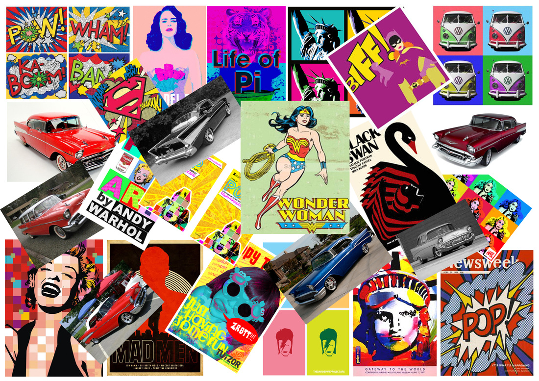
Visual Recording in Others Work
http://uk.pinterest.com/pete57marley/ This link will take you to my Pinterest pages & Picaso / Warhol studies.
Task 2
Visual Recording in Others Work
http://uk.pinterest.com/pete57marley/ This link will take you to my Pinterest pages & Picaso / Warhol studies.
In this task I will be looking at the unique characteristics that differentiate one's work from another. I have chosen to study the work of Pablo Picasso & Andy Warhol, I will be looking at all aspects of each ones work & analyzing each one to show their unique characteristics. I will then analyse at least one individual piece from each of the 2 artists and annotate in depth their styles, technique, processes and concepts.
Pablo Picasso
1881 - 1973
1881 - 1973

This work by Picasso is "Les Demoiselles d'Avignon" from 1907, this is often called the most important painting of the 20th century and often seen as the start of cubism. Picasso had his own distinctive style and this was clear in all his artwork, he painted in many styles such as Primitiveism, Abstraction, Expressionism, Surrealism & Cubism. This painting is the start of his Cubism period (the start of modernism) and features such as flat angular, distorted figures with faces that resemble a cross between African tribal masks & distorted human form. The artwork is very striking and was revolutionary for the time it was painted. There is good use of colour for the skin tones in this work and the background colours compliment this. There are areas of the work with no paint at all, this gives the work depth. The flat angular body forms are a change from other nude paintings of the curved voluptuous body form that was commonly used in that era. This artwork has the look as if it has been created with mosaic's and I think that it is very striking.
The painting exudes sexuality and is most defiantly one of his best known works.
The painting exudes sexuality and is most defiantly one of his best known works.
Mark making in Picasso's work
"Les Demoiselles d'Avignon"
"Les Demoiselles d'Avignon"
Form
The medium that this work has been created in is Oil on Canvas.
The artist has used earthy & flesh tones, with blue's in the background, this creates the draped room effect. The earthy brown & flesh tones in the work give it perspective, and the blue's give it depth. Areas with no paint also enhance this work. There is a lot of abstract/flat angular shapes in this work, with faces that resemble African masks. Quite different from the usual images of the nude form which would have curves.
The work is 243.9 x 233.7 cm in size.
Context
Cubism began between 1907 and 1911.
This work was made in Paris 1906/07. The work is by Pablo Picasso.
Picasso was a prolific artist and he also worked in other mediums, he was a great sculptor, print maker, ceramicist and stage designer.This work is seen as the start of the cubism period in art and has influences from El-Greco.
This work was influenced by African sculptures and masks that he had seen in an exhibition.
Content
This work is called "Les Demoiselles d'Avignon" (The Young Ladies of Avignon) the title of this work works better in the french as this makes it more exotic and European I think. The painting depicts a brothel scene from the turn of the century (1800's-1900's) It shows a group of five prostitutes standing around in the brothel with a bowl of fruit on a table in front of them. The background is drapes being pulled back, this is a sensual abstract (cubist) painting that exudes sexuality. The work was not drawn on the canvas first as there are no signs of pencil or charcoal in it. Picasso did lay down dark paint outlines then later filled the areas with parallel strokes of a loaded brush. This technique can be seen on the foreheads of some of the figures where the paint has formed tiny peaks of impasto at the end of the brushstrokes. Picasso also left the priming layer showing in some areas this creates transparency & luminosity to those areas. The faces of two of the women have been distorted into African mask style, while the other three have the Iberian style of Picasso's native Spain this I think gives the work a dark sinister feel and a savage look, the sharp angular and disjointed body form makes it look fresh and modern none of the figures are conventionally feminine. The work is realistic for the time it was painted I think and the message it is trying to communicate is that of the dark, seedy, sexual side of prostitution in Paris of the day.
Process
This work was created with oil paints on canvas, Probably using brushes & maybe pallet knife as the canvas is so big. I have not seen these but Picasso used many sketches and took influences from other artists of the day and before his time.It appears that Picasso laid the composition in with oil paint rather than first transferring his sketches to the canvas in pencil, as there is no evidence of underdrawing in pencil or charcoal. In some places Picasso began by outlining areas in dark paint, eventually filling in forms with parallel strokes of a loaded brush. This technique is evident in the foreheads of the two central women (posed with their arms above their heads), where the paint has formed
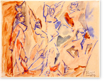
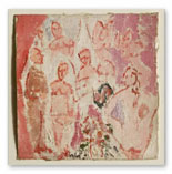
The two images below, show development of the artists work for the final design. These are separate works of art in their own right. The image on the left is a watercolor measuring 6 3/4 X 8 3/4" the right hand image being done in oil and was 7 1/2 X 8". These works are very small and are planning the layout for the final composition, in the right hand image there are seven figures, two of which are male ( not used in final work). Scientific analysis indicates that similar pigments were used in both the small sketch and the large canvas. These images show that Picasso was planning for some time for his final work.
The medium that this work has been created in is Oil on Canvas.
The artist has used earthy & flesh tones, with blue's in the background, this creates the draped room effect. The earthy brown & flesh tones in the work give it perspective, and the blue's give it depth. Areas with no paint also enhance this work. There is a lot of abstract/flat angular shapes in this work, with faces that resemble African masks. Quite different from the usual images of the nude form which would have curves.
The work is 243.9 x 233.7 cm in size.
Context
Cubism began between 1907 and 1911.
This work was made in Paris 1906/07. The work is by Pablo Picasso.
Picasso was a prolific artist and he also worked in other mediums, he was a great sculptor, print maker, ceramicist and stage designer.This work is seen as the start of the cubism period in art and has influences from El-Greco.
This work was influenced by African sculptures and masks that he had seen in an exhibition.
Content
This work is called "Les Demoiselles d'Avignon" (The Young Ladies of Avignon) the title of this work works better in the french as this makes it more exotic and European I think. The painting depicts a brothel scene from the turn of the century (1800's-1900's) It shows a group of five prostitutes standing around in the brothel with a bowl of fruit on a table in front of them. The background is drapes being pulled back, this is a sensual abstract (cubist) painting that exudes sexuality. The work was not drawn on the canvas first as there are no signs of pencil or charcoal in it. Picasso did lay down dark paint outlines then later filled the areas with parallel strokes of a loaded brush. This technique can be seen on the foreheads of some of the figures where the paint has formed tiny peaks of impasto at the end of the brushstrokes. Picasso also left the priming layer showing in some areas this creates transparency & luminosity to those areas. The faces of two of the women have been distorted into African mask style, while the other three have the Iberian style of Picasso's native Spain this I think gives the work a dark sinister feel and a savage look, the sharp angular and disjointed body form makes it look fresh and modern none of the figures are conventionally feminine. The work is realistic for the time it was painted I think and the message it is trying to communicate is that of the dark, seedy, sexual side of prostitution in Paris of the day.
Process
This work was created with oil paints on canvas, Probably using brushes & maybe pallet knife as the canvas is so big. I have not seen these but Picasso used many sketches and took influences from other artists of the day and before his time.It appears that Picasso laid the composition in with oil paint rather than first transferring his sketches to the canvas in pencil, as there is no evidence of underdrawing in pencil or charcoal. In some places Picasso began by outlining areas in dark paint, eventually filling in forms with parallel strokes of a loaded brush. This technique is evident in the foreheads of the two central women (posed with their arms above their heads), where the paint has formed
The two images below, show development of the artists work for the final design. These are separate works of art in their own right. The image on the left is a watercolor measuring 6 3/4 X 8 3/4" the right hand image being done in oil and was 7 1/2 X 8". These works are very small and are planning the layout for the final composition, in the right hand image there are seven figures, two of which are male ( not used in final work). Scientific analysis indicates that similar pigments were used in both the small sketch and the large canvas. These images show that Picasso was planning for some time for his final work.
|
|
Mood
Picasso has made this artwork have a sexual, yet warm feel.
It makes me feel like this because of the content of the naked female form.
The colour's used do add to the mood, the earthy & blue colour's of the drapes & background compliment the flesh tones of the figures. there are also areas with no paint at all, this gives the work depth.
The work creates an atmosphere, that of a french brothel.
Mark making
In this Picasso work there are many elements of art, mark making. There are straight lines, curved lines, abstract (organic) shapes, regular shapes. There is use of light and dark and even areas with no paint at all. The colours of the flesh tones vary in each figure. All this creates depth and the perspective in the work. The colour of the drapes bring warmth into the work.

Another of Picasso's famous works
The painting left is Guernica from 1937, It was created in response to the bombing of Guernica a Basque country village in northern Spain, by German and warplanes at the behest of the Spanish Nationalist forces on 26 April 1937 during the Spanish civil war. This is a very dark painting, that shows the death and destruction of the Village of Guernica. It shows the horror of the people, there is no colours other than black, white & grey's in this and I think that it is very striking and grabs the attention of the viewer. Both these paintings are in the cubism style, Cubism was the first of the Abstract Art movements of the 20th century and Picasso and Georges Braque were the main founders of this style. An art critic at the time said one canvas looked like a sheet of broken glass. This style almost looks like that it has been done in mosaics, the style is very angular and sharp with almost no curves. The paintings look as if they have block printed. Picasso was not just a painter he also was a great sculptor, print maker, ceramicist and stage designer, Picasso was considered radical in his work and was the inspiration to many that followed.
.
Andy Warhol
1928 - 1987
1928 - 1987

Andy Warhol was a successful magazine and ad illustrator who became a leading artist of the 1960s Pop art movements. As Warhol himself put it, "Once you 'got' pop, you could never see a sign the same way again. And once you thought pop, you could never see America the same way again."
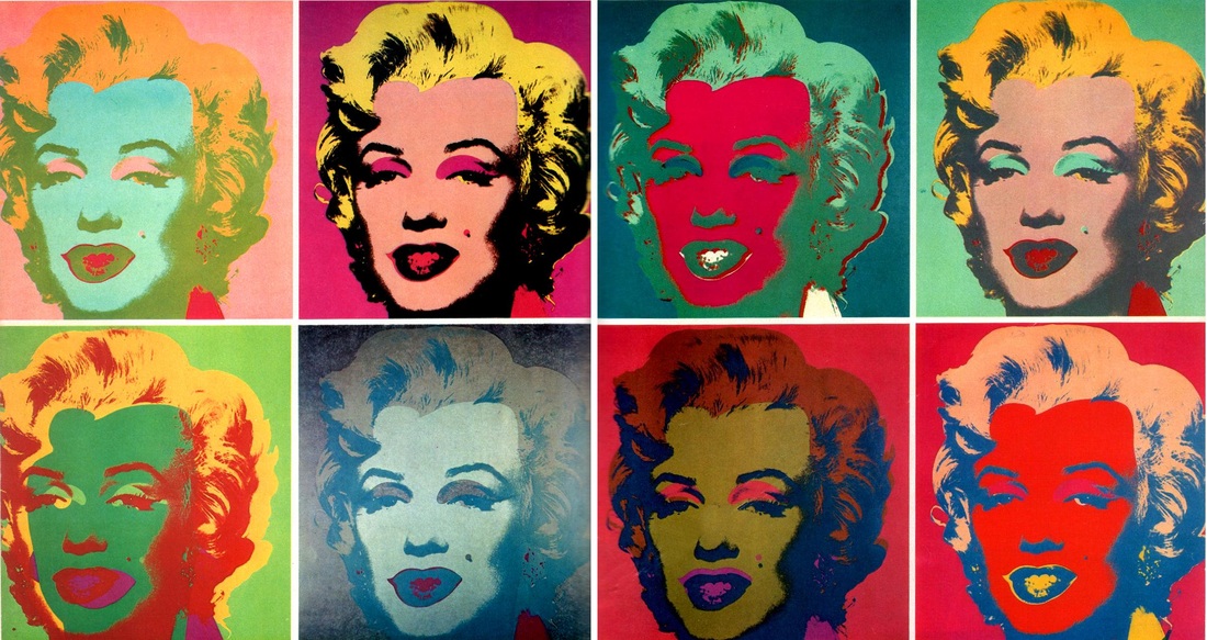
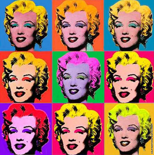
Warhol took everyday items and household names and produced iconic images of them such as the Marilyn Monroe image on the left. Other iconic images he used were the Campbell's soup can & Coke-Cola bottle, these were all done in many very bright florescent colours mainly in screen print form. These images have an iconic comic book look to them and are often seen in group's of four or more in contrasting colours, this made things easy for the mass market.
Below you can see the image of Marilyn Monroe that Warhol used for these images. His portrait " Eight Elvises" (Below) eventually resold for $100 million in 2008, making it one of the most valuable paintings in world history. Warhol was one of the most famous faces of the New York scene for most of the 60's, 70's & and early 80's often seen in the night clubs such as "Studio 54" till his death at 58 in 1987.

|

Repetition in Warhol's works.
His repetition also aims at showing how excessive consumerism & pop culture can be IE. he uses repeated images of pop icons Elvis Presley & Marilyn Monroe to show how society churns out celebrities like a factory + images of consumer items: soup-cans & coke bottle. |
Mark making in Andy Warhol's work.
Form
Acrylic on canvas, 2054 X 1448 mm
This Marilyn image is a silkscreen print, this is done with a series of stencils and mesh. Ink is forced into the mesh by a fill blade, squeegee on to the printing surface. Very vibrant colours were used on this work, Pink (in different shades), Yellow & Black's to create the shadow highlights. Warhol also produced these images in many vibrant colour combinations.
|
|
Context
Popart was a follow on from the abstract impressionism movement of the 40's & 50's a development of abstract art which originated in New York and was aimed at subjective emotional expression with particular emphasis on the spontaneous creative act (e.g. action painting). Popart was first seen in New York in the 50's and was inspired by everyday objects and bright colours, so that everyone could appreciate and enjoy it. It used advertising imagery, photographs and ordinary elements of consumerism (like soup cans, cereal boxes etc) to make it more connected to people.The Pop in pop-art stands for Popular culture. Images are drawn from current movies, media event, and the news. Many pop artist also use famous or recognisable faces in their work. Famous pop artists include Andy Warhol, Roy Lichtenstein, Patrick Caulfield, Blek le rat, Banksy, Pixnit etc. In August 1962, Andy Warhol began to produce paintings using the screen printing process. He recalls, “The rubber-stamp method I’d been using to repeat images suddenly seemed too homemade; I wanted something stronger that gave more of an assembly-line effect. With silk screening you pick a photograph, blow it up, transfer it in glue onto silk, and then roll ink across it so the ink goes through the silk but not through the glue. That way you get the same image, slightly different each time. It all sounds so simple—quick and chancy. I was thrilled with it. My first experiments with screens were heads of Troy Donahue and Warren Beatty, and then when Marilyn Monroe happened to die that month (August 1962), I got the idea to make screens of her beautiful face.” (Andy Warhol, Popism, 1980) (this is a quote from Warhol) This work was made in New York, Andy Warhol was one of the most influential pop artists of his time, and produced many iconic images such as the Campbell s soup can & Coke bottle. This work relates to the swinging sixties and the pop art revolution that was happening in that time well, the Beatles were touring America and everything was technicolor. Warhol was also a film maker and music producer who was responsible for the band Velvet Underground.
Content
This work is of Marilyn Monroe and is titled "Marilyn Diptych", it was created shortly after her death in 1962. It is a screen print acrylic paint on canvas in a portrait style, this is very realistic as the original photograph was used from for publicity shot for the 1953 film Niagara. It is produced in many color combinations all of which are bright & eye catching with black & white used for the features and shadowing. Warhol was fascinated by death and a Diptych in early christian times was a hinged carved object that had an image of the living on one side and the dead on the other. I think that this work portrays that there is life after death.
Process
This work is a silk screen print using acrylic paint on canvas, this process is done by using woven mesh to support an ink blocking stencil to get the desired image. The stencil has open areas where ink or paint are pressed through the mesh by a squeegee to create the image this process can be used on lots of different materials such as :- t-shirts, posters, stickers, vinyl, wood, or other material.
Silkscreen printing or stenciling has been around since before 500 AD. By the 1600's, silk-screen printing was a highly developed art in China and Japan, and there are many books that show the development of this technique over the years.
Mood
Although this work was created after her death, this image gives the feeling of life. Very colorful just like Marilyn lived her life. The work makes me feel happy, the color's are bright and vibrant and bring the work to life.
Markmaking
There are no straight lines in this work, Warhol used the original image as a template for this so there are lots of curves and organic (freeform) shapes. There is a great use of color & black & white for features and highlights in the work.
Repetition is very evident in a lot of Andy Warhols work, such as the work above with lots of images of Marilyn Monroe in all different colours.
My Popart Style Moodboard
|
|
My ideas for my poster layout sketches.
The sketches below are also a form of mark making , in a manual form.
The sketches below are also a form of mark making , in a manual form.
|
|
Above you will see two scans for my poster layout ideas, I have kept the originals for my work folder. My poster developed much further than this as you will see later down the page. I have done this poster in a Andy Warhol popart style of everyday things in a popart style.
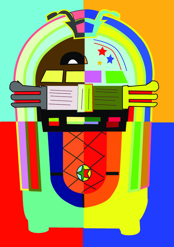
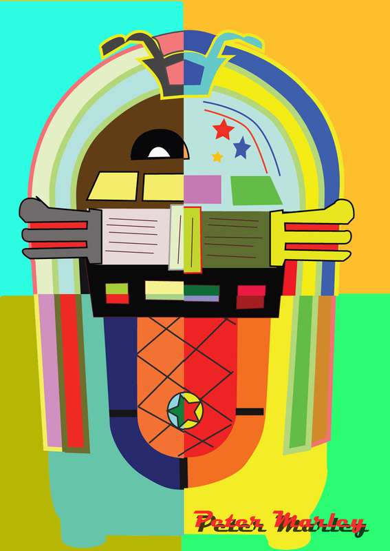
Jukebox Popart style done in Adobe illustrator.
4 different versions split to create one.
(image below right used as a template I need to do joints with a scalpel to make them sharper)
4 different versions split to create one.
(image below right used as a template I need to do joints with a scalpel to make them sharper)
|

|
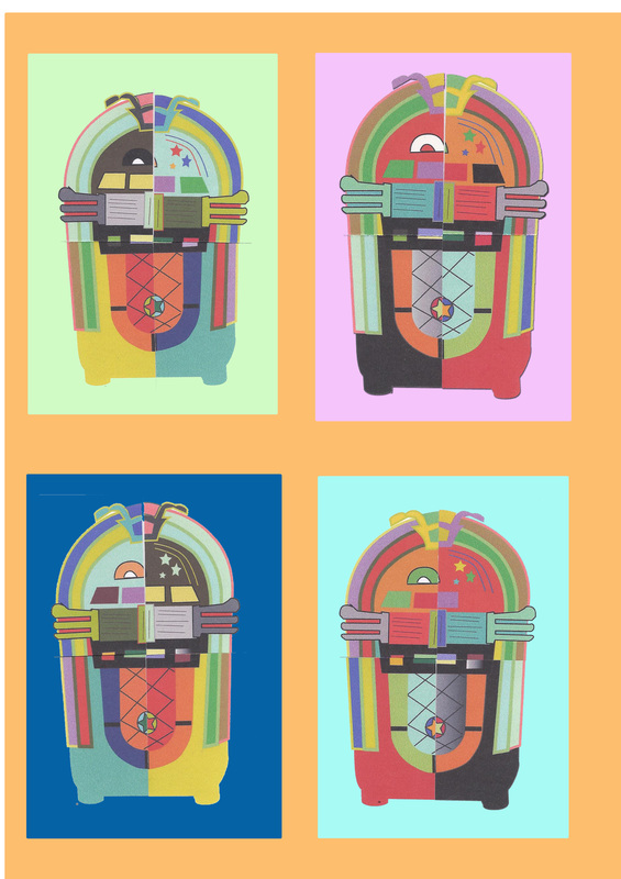
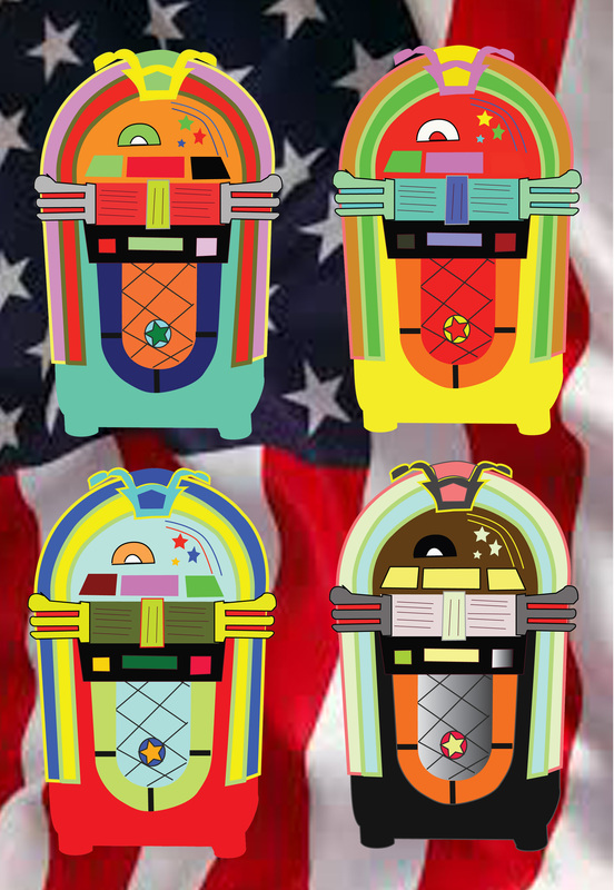
Below right you can see the four jukeboxes that I created in illustrator in different bright popart style. The image on the left is of the jukeboxes after that I had split them into four and mixed them up, this was done by printing them out and cutting them as you can see the joins are not to good.
|
|
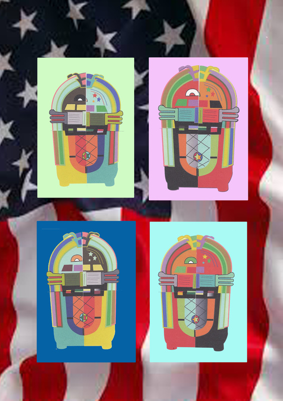
The two images below are of the same jukebox images but I placed an American flag behind them, I done this because my poster is for an Americana event. These were just experiments in my thought process but were discarded at a later date.
|
|
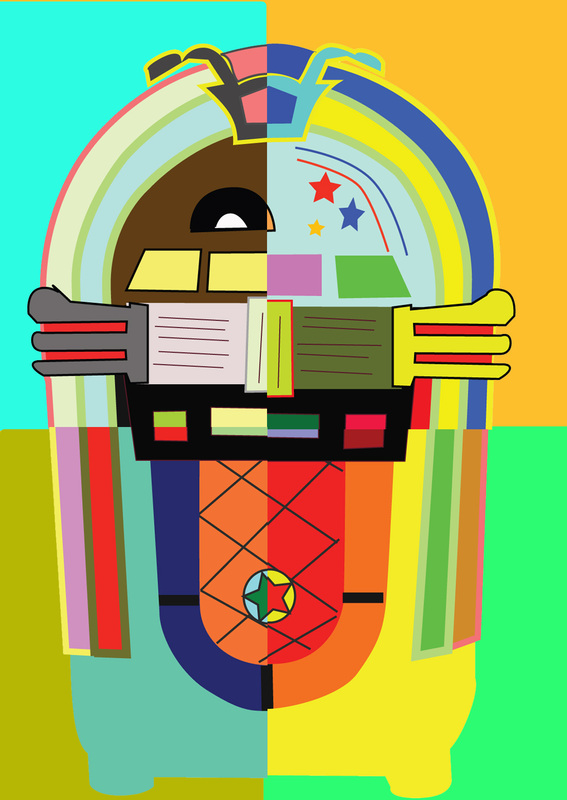
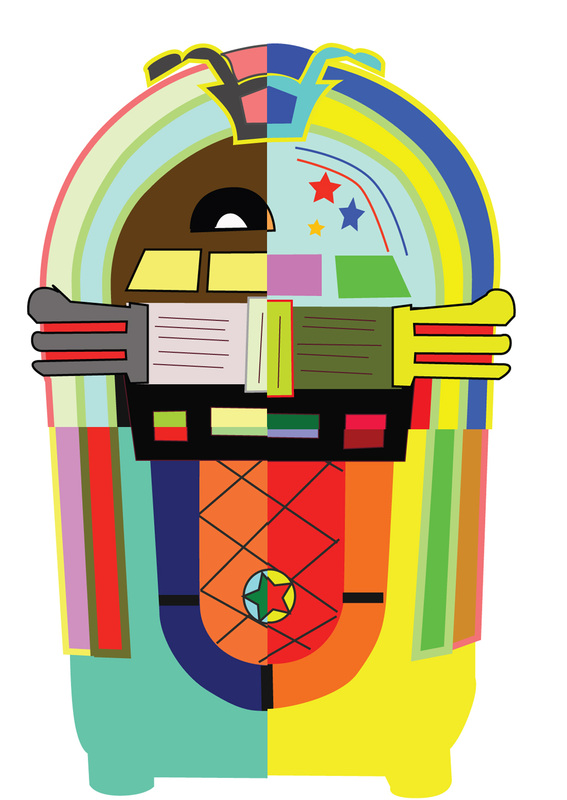
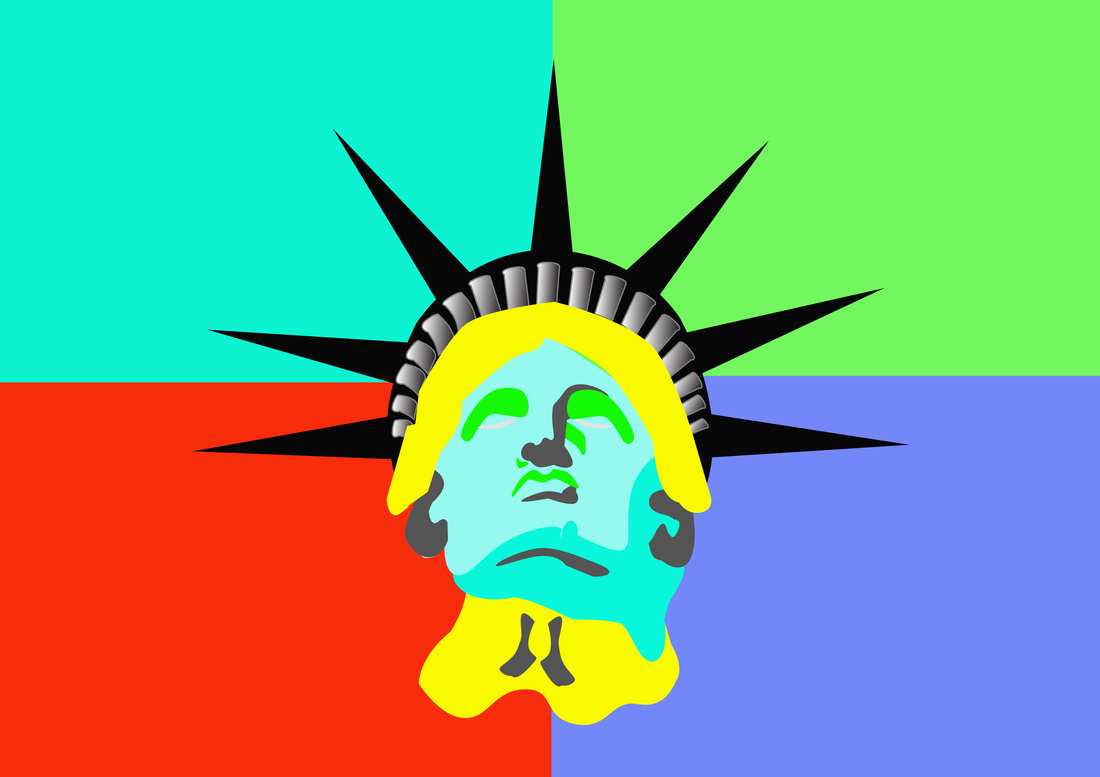
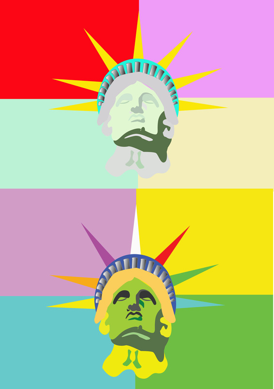
The two popart images below I have done into quarters in adobe photo shop, using the rectangle marquee tool. While doing this you can also change the background colour of each section. This I think gives a great effect and gives the image a true Warhol look.
|
|
The screen shots above & below show how that I done the jukeboxes in photoshop and split them into four. They also show the layers palette with each individual corner of a jukebox and the colour section laid below them.

Popart Style Jukebox.
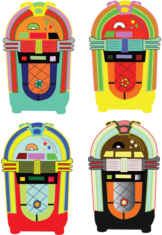
I created these popart style Jukeboxes in Adobe illustrator, I found an image of the jukebox on the internet and used it as a template. I used the pen tool to create this and the convert anchor point tool to create the curves. I created a new layer for each item of the jukebox I ended up with 33 layers in the end, this enables to change the colour or shape of each individual section independently. I first created one jukebox and copied & pasted another three, then changed the colour of each one. Each individual jukebox was printed out and split in to 4, I had various attempts at this with the first ones not to good. The first attempts at this I folded ihe images and used a knife to cut the fold, this left a jagged edge and looked a mess. I then tried using a paper guillotine this was not to successful either as this left the edge rough. Then I used a craft knife as this gives a cleaner sharper edge to work with. The tape I was using to join each image was very sticky and sections needed to be positioned very carefully. Once all four images were together I scanned them individually and opened them in Adobe photoshop where I added a drop shadow and a contrasting colour for each background. In two images above I used the American flag as a background just to see how it looked. I intend to split each jukebox in photoshop this will give me a seamless join.
I created these popart style Jukeboxes in Adobe illustrator, I found an image of the jukebox on the internet and used it as a template. I used the pen tool to create this and the convert anchor point tool to create the curves. I created a new layer for each item of the jukebox I ended up with 33 layers in the end, this enables to change the colour or shape of each individual section independently. I first created one jukebox and copied & pasted another three, then changed the colour of each one. Each individual jukebox was printed out and split in to 4, I had various attempts at this with the first ones not to good. The first attempts at this I folded ihe images and used a knife to cut the fold, this left a jagged edge and looked a mess. I then tried using a paper guillotine this was not to successful either as this left the edge rough. Then I used a craft knife as this gives a cleaner sharper edge to work with. The tape I was using to join each image was very sticky and sections needed to be positioned very carefully. Once all four images were together I scanned them individually and opened them in Adobe photoshop where I added a drop shadow and a contrasting colour for each background. In two images above I used the American flag as a background just to see how it looked. I intend to split each jukebox in photoshop this will give me a seamless join.
|
|

Above and below you can see the many different images that I created in a popart style to experiment what would look best in my final poster layout, You will notice that I have not used all the images such as the car split into four I will keep this for future projects.
|
|
|
|

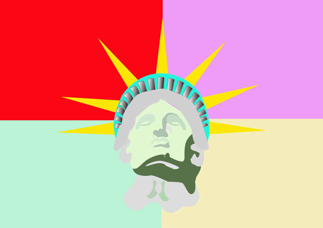
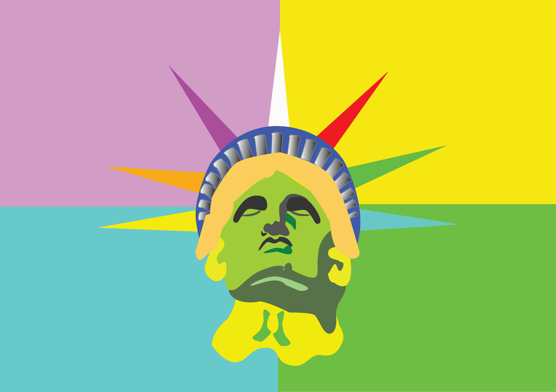
The Statue of Liberty is an iconic symbol of America & New York. I used the image on the left to create my Liberty popart images in adobe illustrator, this is done by importing the image into illustrator and using it as a template. When that you have done this it is simple to select an item and change the colour of it. Below you can see screen shots of my work in adobe illustrator, the first one having the template showing.
Above & below are my screen shots of the process of making my Statue of Liberty in illustrator, you can once again see the layers palette in each screen shot. In the top image you can see the image of the Statue of Liberty that I used as a template to create this image.

|

|
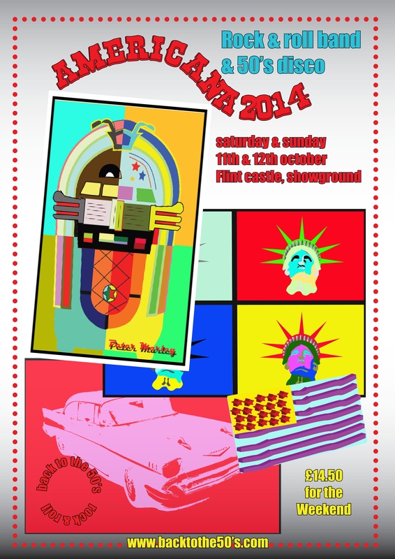
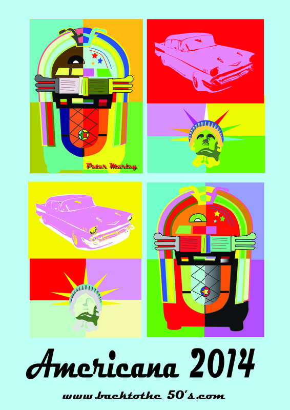
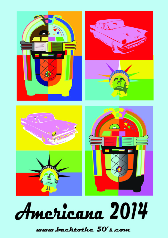
Above & below you can see the many manifestations of my poster layout, There are changes in all of them from the first attempt top right which I removed the flag from the background. In the top left layout I have made the images bigger and overlapped them, this did'nt look right either. Also there is less text information in this one so text boxes could be removed to give a less cluttered look I also added a web address so the intended audience can gather more information. The bottom right layout still has the images overlapping and I added a flag that I created in illustrator. In the layout bottom left Things have been moved around and re-sized, this gives the layout a cleaner look but still not what I was looking to achieve. I also changed the colour of the dotted border in this layout.
|
|

The poster lay out left I changed the colour & direction of the gradient background layer. I also changed the colour of the text to make it stand out more. The layout looks fresh and less cluttered but still nor right. The vector flag in the bottom right of the layout did not look in keeping with the popart style of the poster so was not used in my final layout design.
|
|
In the two layout's above you can see the making of my final design, they are less cluttered again with minimal text information. The image on the left has my name on one of the jukebox images which I changed & replaced with a compleat new jukebox image. The bottom image of the statue of Liberty in the left hand layout is lost slightly as the colours are to similar, so I re-done another with more contrasting colours to make it stand out more in the right layout.
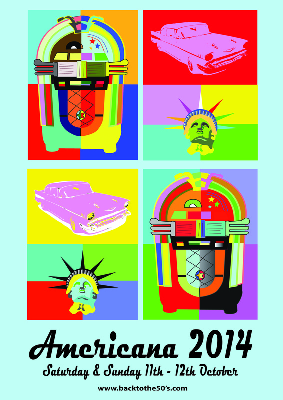
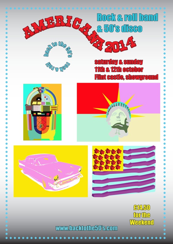
The layout above is almost compleat now, I have added the date of the event. I have also changed the font style of the web site address to a bolder smaller style that make it easier to read. Once this was printed out in A3 size you could see that the jukebox images needed to be tweaked and tidied up as some of the joints were not sharp enough.

Mark Making in my Final Poster.
The mark making in my final poster, I used digital mark making for this as it gives it a cleaner & sharper look. I used Adobe illustrator for this as I have used this software many times before, I could produce better quality images than if I had done it manually. With this software I could also make one image then copy it many times so they were all exactly the same, then I could change the colours of each individually I also used Adobe photoshop to split the images into four so I could mix the colours around. This I had tried to do manually with differing degrees of success printing the images out & firstly cutting them into four with scissors, then I used a craft knife for a cleaner edge. Putting them back together was the problem so the photoshop images look seamless.
In my poster there are many formal elements such as Balance This was created by using four images of the same size, Symmetry was done by placing the images so if you fold it in half then squint (so you aren't seeing the actual words and images) to see if each half looks the same. , Contrast was created by using colours that complimented each other & Repetition was created by using the images more than once to create the work. I think that the composition of the poster is very good, it is bright & eye-catching and communicates the massage across to the target audience very well.
Popart poster in Andy Warhol Style
In this exercise for my course I had to first study two artists (I chose Picasso & Andy Warhol). I had to pick a piece of each ones work and evaluate it, then point out different mark making styles and processes in their artworks. This was then followed by the decision of which artists style that I would use for my poster exercise. I have always liked popart and Andy Warhols works in particular so the decision was easy, popart style it was.
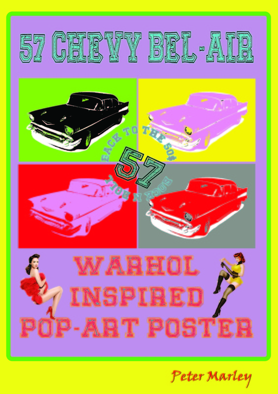
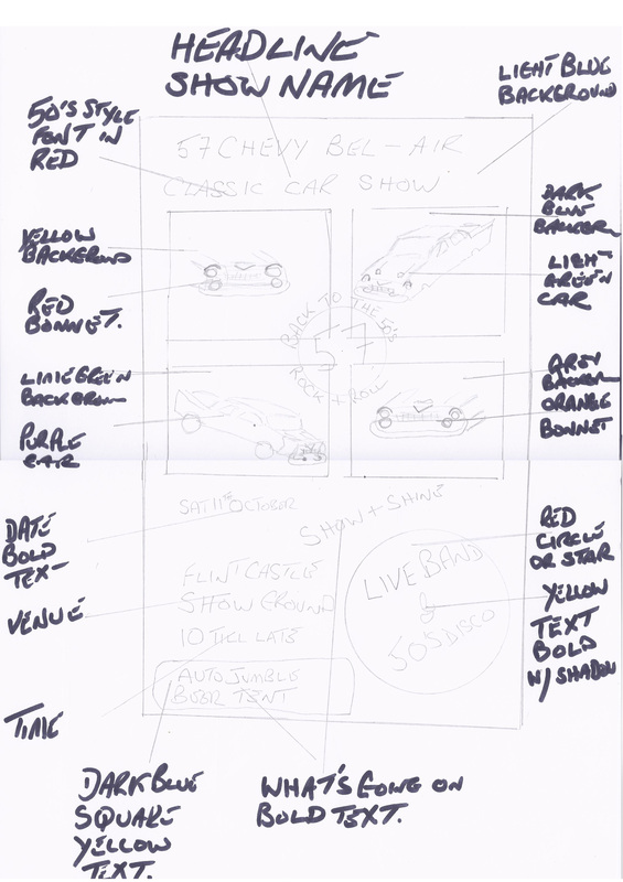
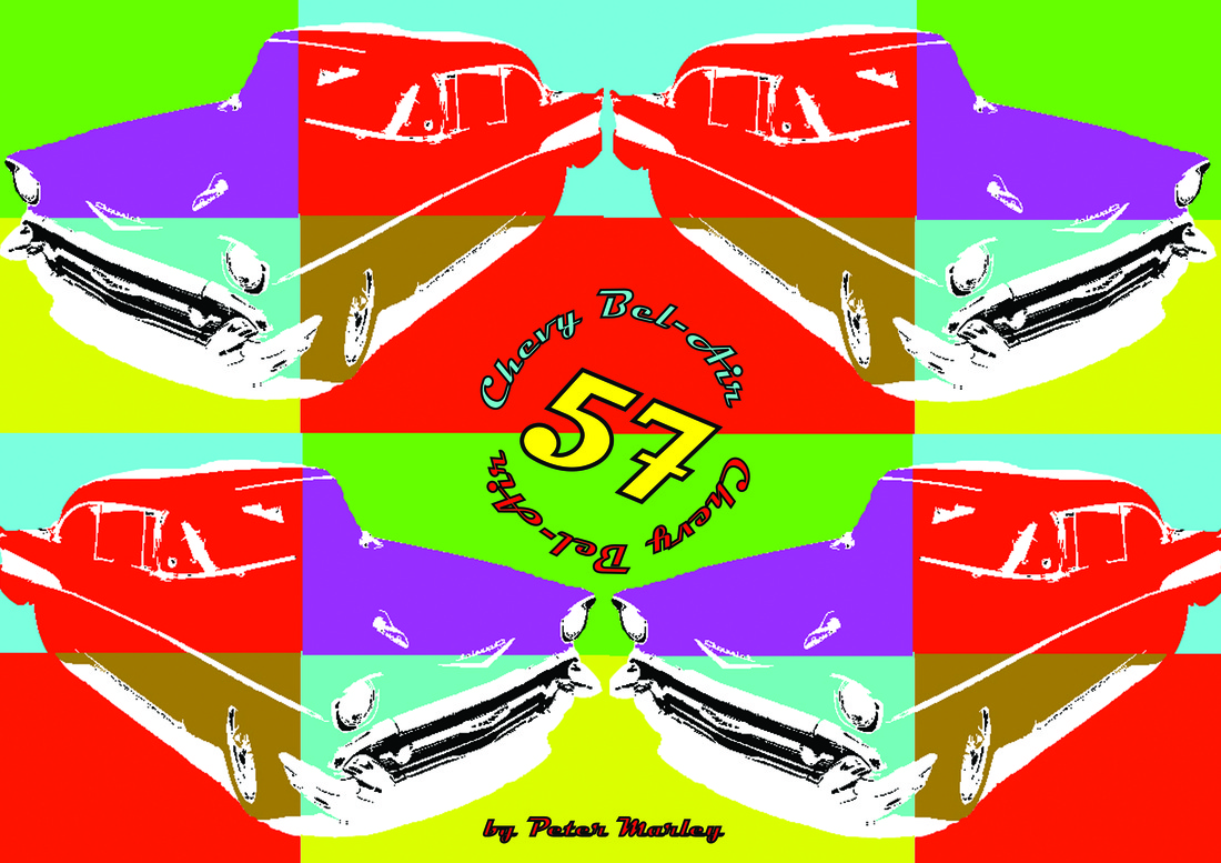
I like all things American and the 50's & 60's in particular, I came up with the idea for an American theme for my poster, and firstly looked on the internet for inspiration for things to do in a popart style. I firstly looked a 50's American cars and chose a 57 Chevy Bel-Air as this is an iconic 50's car and thought it would look good in the popart style. I made some sketches of proposed layout ideas then made a popart moodboard. Then I got down to the transformation of the car, this I done in adobe photoshop by deleting the background of the image and then changing the car to With photoshops threshold tool Image > Adjustments > Threshold. This opens the threshold dialogue box and with the slider at the bottom you can take as much detail as you want from the image. Once this had been done you can change the colour of the image to what ever you want, with the colour fill layer. Open a new layer and move it to the bottom in your layers palette and add a colour to this for the background.
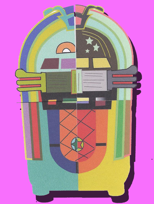
I then had the idea of a Wurlitzer Jukebox so I got a image of one and used it as a template in adobe illustrator. This was quite easy to do with the pen tool to make the basic shapes then the convert anchor point tool to create the curves. Then with the stroke & fill feature you can change the colours to anything that you want, I copied & pasted the image so I had four of them then altered the colour of each one. The jukebox images were then opened in photoshop and using the rectangular marquee tool were split into four then mixed up with a contrasting colour background in each section then joined up.
The Statue of Liberty image was done the same way as the jukeboxes in illustrator. I had all my images ready now for my poster, and so the process of the layout began.This had many manifestations along the way and the final layout looks nothing like the first sketches that I had done.
I have found this exercise very interesting, and I have looked more closely at Picasso & Warhols work. I have learned techniques of popart in adobe photoshop & illustrator which I can use in future works that I do.
The final poster layout I think is very eyecatching, clear & precise you know what that the message to the audience is. The use of the popart American images is good and gives the layout design a retro look. The layout is UN-cluttered and easy to read, the font style used (Magneto) also adds to the overall American theme of the poster.
There is a lot of repetition in Andy Warhols work and I have used this in my poster to good effect I think. Another way to create repetition would be to use The custom brush tool in photoshop, I have done this in a previous exercise.
In this exercise for my course I had to first study two artists (I chose Picasso & Andy Warhol). I had to pick a piece of each ones work and evaluate it, then point out different mark making styles and processes in their artworks. This was then followed by the decision of which artists style that I would use for my poster exercise. I have always liked popart and Andy Warhols works in particular so the decision was easy, popart style it was.
I like all things American and the 50's & 60's in particular, I came up with the idea for an American theme for my poster, and firstly looked on the internet for inspiration for things to do in a popart style. I firstly looked a 50's American cars and chose a 57 Chevy Bel-Air as this is an iconic 50's car and thought it would look good in the popart style. I made some sketches of proposed layout ideas then made a popart moodboard. Then I got down to the transformation of the car, this I done in adobe photoshop by deleting the background of the image and then changing the car to With photoshops threshold tool Image > Adjustments > Threshold. This opens the threshold dialogue box and with the slider at the bottom you can take as much detail as you want from the image. Once this had been done you can change the colour of the image to what ever you want, with the colour fill layer. Open a new layer and move it to the bottom in your layers palette and add a colour to this for the background.
I then had the idea of a Wurlitzer Jukebox so I got a image of one and used it as a template in adobe illustrator. This was quite easy to do with the pen tool to make the basic shapes then the convert anchor point tool to create the curves. Then with the stroke & fill feature you can change the colours to anything that you want, I copied & pasted the image so I had four of them then altered the colour of each one. The jukebox images were then opened in photoshop and using the rectangular marquee tool were split into four then mixed up with a contrasting colour background in each section then joined up.
The Statue of Liberty image was done the same way as the jukeboxes in illustrator. I had all my images ready now for my poster, and so the process of the layout began.This had many manifestations along the way and the final layout looks nothing like the first sketches that I had done.
I have found this exercise very interesting, and I have looked more closely at Picasso & Warhols work. I have learned techniques of popart in adobe photoshop & illustrator which I can use in future works that I do.
The final poster layout I think is very eyecatching, clear & precise you know what that the message to the audience is. The use of the popart American images is good and gives the layout design a retro look. The layout is UN-cluttered and easy to read, the font style used (Magneto) also adds to the overall American theme of the poster.
There is a lot of repetition in Andy Warhols work and I have used this in my poster to good effect I think. Another way to create repetition would be to use The custom brush tool in photoshop, I have done this in a previous exercise.
Evaluation of work.
I started this project with great enthusiasm, I had to look at two artists work so chose Pablo Picasso and Andy Warhol. I then had to look at a piece of each artists work more closely then choose one artist to produce a poster in their style. I have chosen Andy Warhol, as I like the popart era and Warhol's work in particular.
I started this project with great enthusiasm, I had to look at two artists work so chose Pablo Picasso and Andy Warhol. I then had to look at a piece of each artists work more closely then choose one artist to produce a poster in their style. I have chosen Andy Warhol, as I like the popart era and Warhol's work in particular.
- My personal strengths & weaknesses. I like to work on projects that I have an interest in myself, this project was an easy choice for my poster. When that I get an idea I usually go straight in and research other works in the same style, this was done over the internet. One of my weaknesses is that I do not take long enough to plan my work out, (I had done sketches of my layout plan but the final layout is different) I do work then change it quite a few times. I like to do more of the practical work on the PC in photoshop or illustrator as I enjoy this part of the project. I am quite competent in both of the Adobe software packages, I had to tweak some of my images as the joins were not sharp and did not look professional.
- Research that was undertaken. I used the internet to research popart posters and Andy Warhol in particular. With this research I found the style that I wanted for my poster which was bright and colourful as most popart images are. I was inspired by Warhols Marilyn work as this is something that really interests me anything American. I used DA Font on the internet to look for American style fonts, I had a font in mind but found another one that went with the layout and was a better style Magneto Bold was used in the end.
- How my research helped me progress in this assignment. Looking through all the popart posters and images gave me the initial idea for my poster, this was for an Americana day. I looked for iconic American images that I could give the popart treatment to. Bright colours were used to transform a 57 Chevy Bel-Air, Statue of Liberty & Whurlitzer jukebox. I then done some research on different fonts to use as I have commented above.
- What new things I have learnt in this assignment.The main thing that I learnt from this assignment was that less is more, keep your layout simple and less cluttered. This gives your work a more professional look.
- Could your work be improved, if you did it again, how would you improve it.I don't think that there is any work that could not be improved, this I think is personal taste. What one person likes another dislikes, your work should appeal to it's target audience so this sometimes won't appeal to everyone. My own work on this project, I don't think that I would change anything. If there was anything that I would change it would be the joints on my jukebox images, This is only a slight change as if you look closely some are not quite correct
