Task 3 WAPA popart
Done in Adobe illustrator
In this task I will be refreshing my adobe illustrator skills, I am going to be doing a WPAP pop art image. I have not tried this before so I am very interested in how that it turns out. I have chosen an image of Frank Sinatra to do, WPAP pop art is quite a new style and always uses an image of a face. Wedha Abdul Rasyid was the first to come up with this style. Wedha, originally from Indonesia, created his art work in traditional mediums early in the 1990s, which later in early 2000, crossed over into the digital world. Vector being the natural choice for such a colorful, geometric style. This WPAP style mostly is very colourful there are some images that use a background but i am going to use colour,
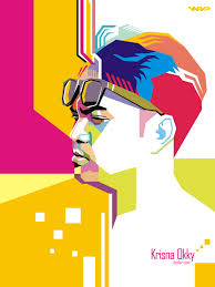
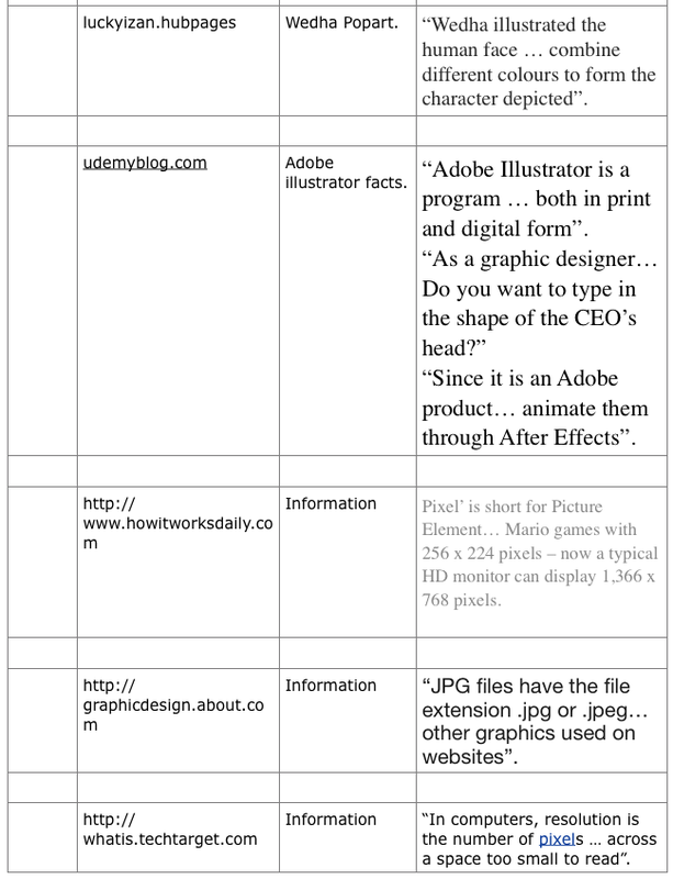
Some WPAP pop art images that i have looked at on the internet for guidance for my own work.
|

|
Below is my own work progressing.
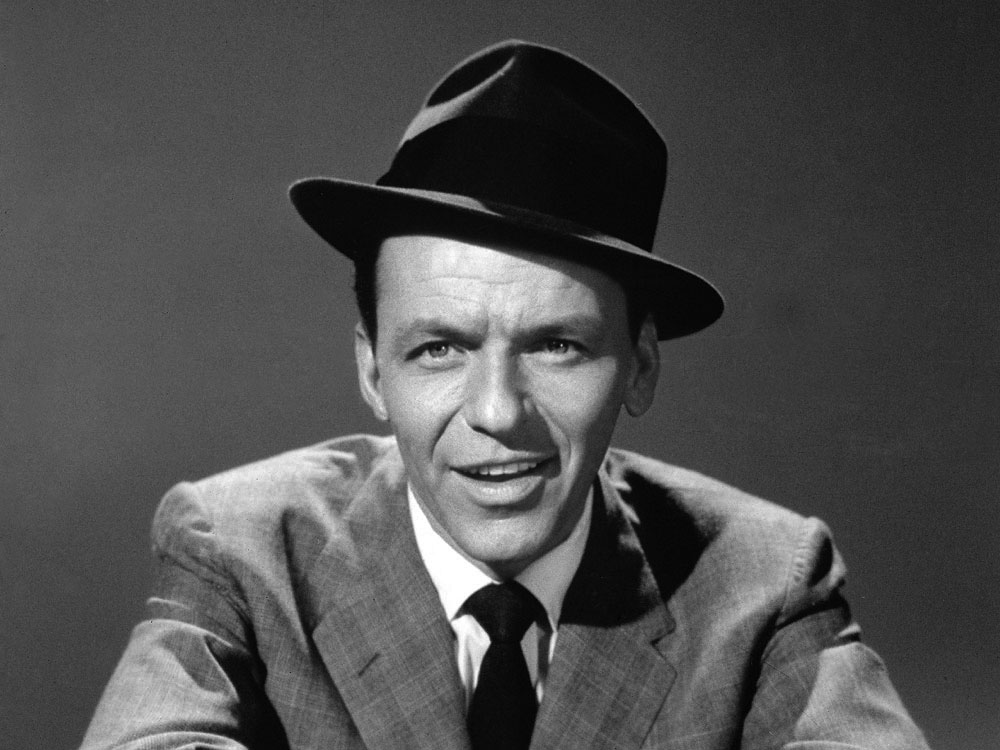
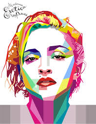
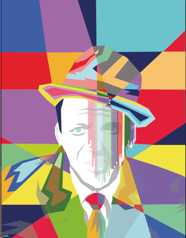
This is the image of Frank Sinatra that I started with.
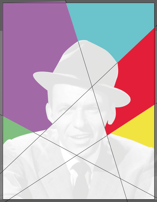
The images above and left are showing my progress with this. most start from the centre outwards but I have done mine different there is still some detail to add to the jacket then finish the face.
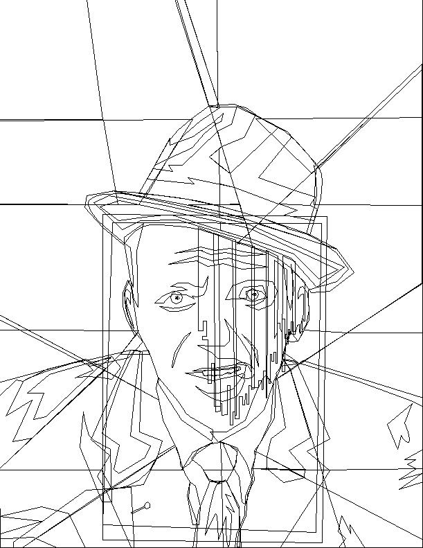

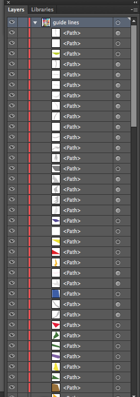
Above you can see my Sinatra design in outline, so you can see all the paths that were used. Also above you can see a screenshot of my layers palette showing only two layers, then click onto the arrow next to guide lines layer and it opens up to show all the different paths in the layer.
|
I firstly printed a copy of the image off and drawn my first guide lines onto this, then I opened the image in Adobe illustrator and set as a template. Then I created my lines with the pen tool from the toolbox, and started to fill the sections with colour.
|
|
|
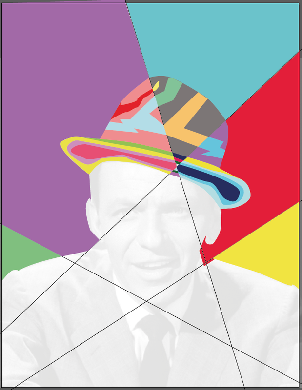
Above you can see two images of my work the one on the right has transparent boxes over it, I had seen this in other peoples work.
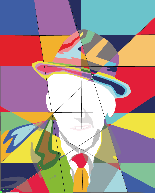
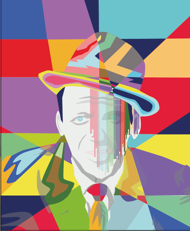
I prefer the left image without the boxes over it, the effect on the face looks like dripping paint someone said. Below you see my final image larger and in more detail. looking at this in detail I have done curves on it, all other WPAP works that I have looked at don't have curves.
I prefer the left image without the boxes over it, the effect on the face looks like dripping paint someone said. Below you see my final image larger and in more detail. looking at this in detail I have done curves on it, all other WPAP works that I have looked at don't have curves.

|
|
Image with curves in it Image without curves.
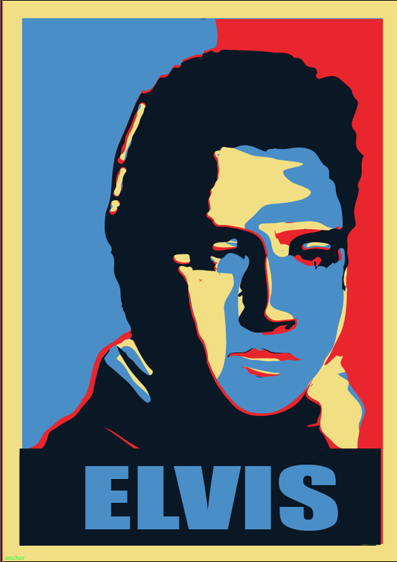
Obama Style Popart done in Adobe illustrator.

Obama Style popart. 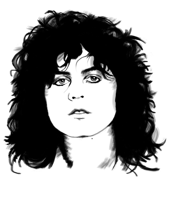
|
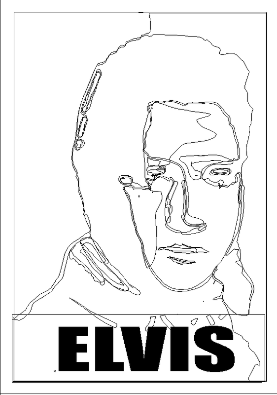
Below you can see my poster set to outline to show all the paths in the layout.
Obama style popart, This iconic poster of Barack Obama from his 2008 election campaign started a new phase in popart. I have done an Elvis one above & a Marc Bolan one below, you can also see the images that I used to create these. More detail on this process in my notes below. 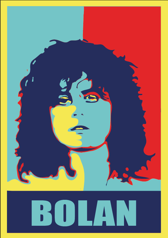
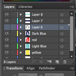
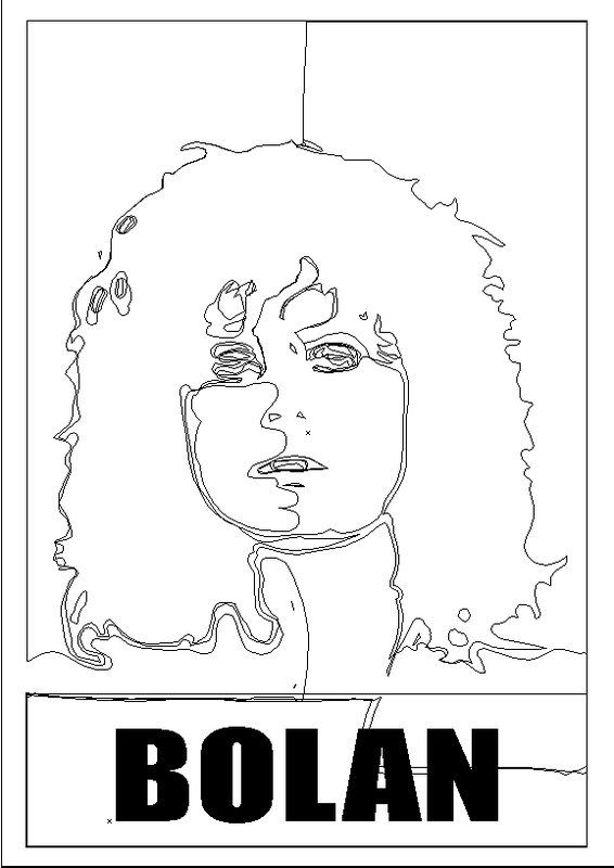
left you can see my Bolan poster in outline to show all the paths in the layout. Aboveyou can see a screen shot of my layers palette showing all the individual layers in the design.
|
Task 3 Adobe illustrator
WAPA Style Popart.
A brief history of WPAP popart. First done by Abdul Rashid Wedha (Indonesian popart)
In about the year 1990-1991, Wedha illustrated the human face as a collection of flat areas formed by lines. This is thought due to lower visibility because of his age he had reached 40 years old, so it is difficult to draw a face in a realistic and detailed style. Wedha then tried to picture cubism style illustration. He described the faces of the figures as arranged in a mosaic of colour are broken up according to its facets. Not in the sense of Cubism but rather combine different colours to form the character depicted.
I have used adobe illustrator many times and think that I am quite proficient at it. For this task I took a look at something new, I have covered popart in an earlier task, doing an Andy Warhol style poster, after getting a link from my tutor I came across a style of popart WPAP. I had not seen this before so after watching a tutorial on the internet I decided to do this style. This is what that I done.
As this style of popart is only seen on faces I looked at some images and came up with an iconic Frank Sinatra image. This image I firstly opened in illustrator, then made it a trace layer. I then with my pen tool from the toolbox I done sone vertical & horizontal lines to make a grid, at this point I printed it out so I could add sketches to it for all the different sections of the image. I was going to scan this to open in illustrator again (I got a new printer & can not scan to my computer as yet). As I could not do this I just used the original with the guide lines on, then used the one with drawn lines for reference. I created the shapes with the pen tool but did not add a fill colour at this time so I could work on my layout. Once I had a few shapes I started to add the fill colour, using the colour dropper from the toolbox you can match other colours in your design (your shape needs to be selected, then select the colour dropper and click your mouse on a colour in your design and same colour will fill shape) This was a very time consuming task as you need to create lots of different shapes to make up the design. This style is very colourful and geometric, on my first attempt I had used curves for the hat and some other features, I created the curves with the convert anchor point tool, this was later used to take the curves out (place your cursor on an anchor point click & drag and you create curves, to get back to straight lines simply click on the anchor point again with the convert anchor point tool).
This style could also be recreated by hand using different colours of fabric or paper cut into the shapes. You could also recreate this with paints or crayons, firstly get your image printed out and draw the lines, shapes onto it and add your colours as required. I think that The illustrator way is best as it is far less messy, and you can get the exact same colours into the design using the colour dropper tool. With Paints or Fabric/paper this would be a fiddly & messy job and also very time consuming . With illustrator you get results in minutes that can be edited as you go along.
Obama Style popart
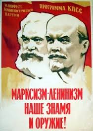
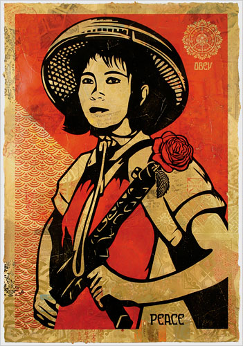
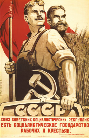
Obama style popart was first seen in 2008 for Barack Obama's presidential campaign and was designed by Shepard Fairey. The poster has two versions one has HOPE on the bottom while the other has CHANGE. Many people have copied this style one with the John Lennon IMAGINE on being one of the most famous. This style of work also can be seen in old propaganda posters where they use only two or three colours to portray a strong message. Such as the examples below.
WAPA Style Popart.
A brief history of WPAP popart. First done by Abdul Rashid Wedha (Indonesian popart)
In about the year 1990-1991, Wedha illustrated the human face as a collection of flat areas formed by lines. This is thought due to lower visibility because of his age he had reached 40 years old, so it is difficult to draw a face in a realistic and detailed style. Wedha then tried to picture cubism style illustration. He described the faces of the figures as arranged in a mosaic of colour are broken up according to its facets. Not in the sense of Cubism but rather combine different colours to form the character depicted.
I have used adobe illustrator many times and think that I am quite proficient at it. For this task I took a look at something new, I have covered popart in an earlier task, doing an Andy Warhol style poster, after getting a link from my tutor I came across a style of popart WPAP. I had not seen this before so after watching a tutorial on the internet I decided to do this style. This is what that I done.
As this style of popart is only seen on faces I looked at some images and came up with an iconic Frank Sinatra image. This image I firstly opened in illustrator, then made it a trace layer. I then with my pen tool from the toolbox I done sone vertical & horizontal lines to make a grid, at this point I printed it out so I could add sketches to it for all the different sections of the image. I was going to scan this to open in illustrator again (I got a new printer & can not scan to my computer as yet). As I could not do this I just used the original with the guide lines on, then used the one with drawn lines for reference. I created the shapes with the pen tool but did not add a fill colour at this time so I could work on my layout. Once I had a few shapes I started to add the fill colour, using the colour dropper from the toolbox you can match other colours in your design (your shape needs to be selected, then select the colour dropper and click your mouse on a colour in your design and same colour will fill shape) This was a very time consuming task as you need to create lots of different shapes to make up the design. This style is very colourful and geometric, on my first attempt I had used curves for the hat and some other features, I created the curves with the convert anchor point tool, this was later used to take the curves out (place your cursor on an anchor point click & drag and you create curves, to get back to straight lines simply click on the anchor point again with the convert anchor point tool).
This style could also be recreated by hand using different colours of fabric or paper cut into the shapes. You could also recreate this with paints or crayons, firstly get your image printed out and draw the lines, shapes onto it and add your colours as required. I think that The illustrator way is best as it is far less messy, and you can get the exact same colours into the design using the colour dropper tool. With Paints or Fabric/paper this would be a fiddly & messy job and also very time consuming . With illustrator you get results in minutes that can be edited as you go along.
Obama Style popart
Obama style popart was first seen in 2008 for Barack Obama's presidential campaign and was designed by Shepard Fairey. The poster has two versions one has HOPE on the bottom while the other has CHANGE. Many people have copied this style one with the John Lennon IMAGINE on being one of the most famous. This style of work also can be seen in old propaganda posters where they use only two or three colours to portray a strong message. Such as the examples below.
|

|
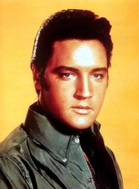
This style I found quite easy to do, firstly find your image that you want to copy and open it in Adobe Photoshop. Then delete your background with tools from the toolbox I used the magic eraser, if your image is in colour change it to black & white. I changed my Elvis image to black & white by going to Image > Adjustments > Black & White. Then I added a layer mask and saved this document. I then went in to Adobe illustrator and opened a new document and added four different colour layers:- Yellow > Light Blue > Red & Dark Blue. Then I dragged & dropped my image on top of these, Then I rasterised this and gave an artistic effect Cutout with the levels set at :- Number of levels 2 > Edge Simplicity 5 > Edge Fidelity 1, Then I had to rasterise it again. I then made the opacity 15% so I could see through it, I started in the top left hand corner and with the Dark Blue layer selected in the layers palette I started to delete the areas that I did not want with my eraser tool so you can see the Red layer beneath. This process was repeated with different colour layers selected to make the image.
This style of art can also be recreated in Adobe Photoshop, a different technique is used in this software. This could also be created by hand, using different colours of fabric or paper cut to shape and also could be done with paints or crayons. Adobe illustrator would be the easiest to create the design I think, less messy and no need to cut shapes out and glue them down then wait for them to dry. Also in illustrator if you make a mistake you always edit it if you cut fabric or paper wrong you have to start again. With paint you would have to be very precise and then wait for it to dry before applying the next colour that borders the first colour to stop them mixing.
I found this task quite easy and really enjoyed doing it, as I have mentioned I use illustrator quite regular and know my way around the toolbox & artboard. This image has come out very well and I am pleased with the look of it. The design is instantly recognizable as Frank Sinatra and would not look out of place along side other designers WPAP designs.
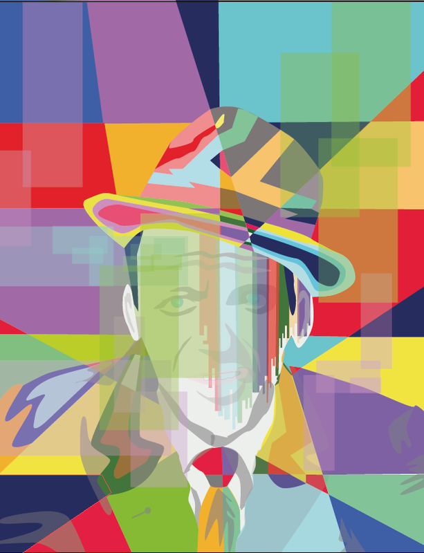
I did not come across any difficulties on this task and look forward to use this style in the future. The only thing that was altered in the design was I had created curves instead of straight lines this was changed so it looks like other WPAP designs.
I think the Obama style pop art is much easier to do but it is very time consuming deleting all the different areas of colour you don't want. I think this is the better style and I will be using this technique many times more in the future.
All in all I think this task has gone very well and the final design looks great.
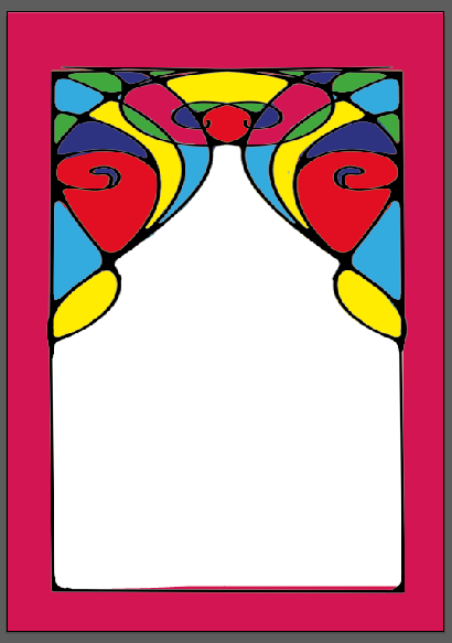
The two images below I created in Illustrator and think they have come out very well.
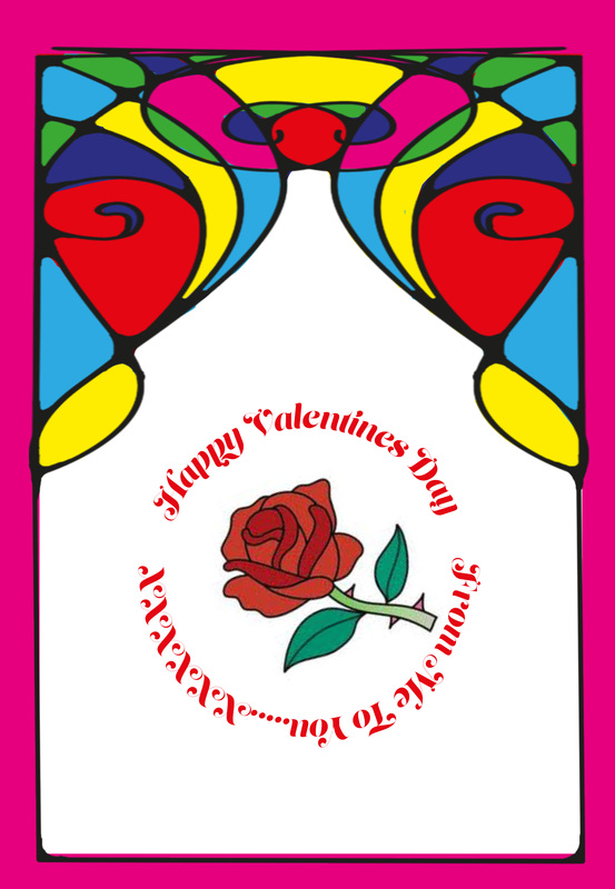
I had the idea for Artdeco glass then as it was the day before valentines day i added the rose & text.
This style of art can also be recreated in Adobe Photoshop, a different technique is used in this software. This could also be created by hand, using different colours of fabric or paper cut to shape and also could be done with paints or crayons. Adobe illustrator would be the easiest to create the design I think, less messy and no need to cut shapes out and glue them down then wait for them to dry. Also in illustrator if you make a mistake you always edit it if you cut fabric or paper wrong you have to start again. With paint you would have to be very precise and then wait for it to dry before applying the next colour that borders the first colour to stop them mixing.
I found this task quite easy and really enjoyed doing it, as I have mentioned I use illustrator quite regular and know my way around the toolbox & artboard. This image has come out very well and I am pleased with the look of it. The design is instantly recognizable as Frank Sinatra and would not look out of place along side other designers WPAP designs.
I did not come across any difficulties on this task and look forward to use this style in the future. The only thing that was altered in the design was I had created curves instead of straight lines this was changed so it looks like other WPAP designs.
I think the Obama style pop art is much easier to do but it is very time consuming deleting all the different areas of colour you don't want. I think this is the better style and I will be using this technique many times more in the future.
All in all I think this task has gone very well and the final design looks great.
The two images below I created in Illustrator and think they have come out very well.
I had the idea for Artdeco glass then as it was the day before valentines day i added the rose & text.
|
|
Web sites I used for research and quotes, Information.