The Logo screen shots below I got from
www.blogspoongraphics.co.uk
www.blogspoongraphics.co.uk
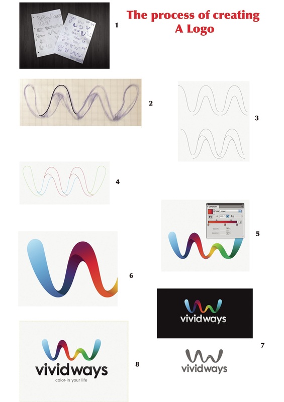
- In image 1 you can see the designers ideas sketched out.
- Sketch was opened in illustrator to use as a template.
- The peak outline was then copied and pasted, then moved to the side until the lines connected.
- The paths were then edited with the Scissors Tool, and joined in specific places to make solid shapes out of each segment.
- The wave was made out of individual shapes so colour could be added with a gradient, to make design look seemless.
- To give the three dimensional impression extra black was added to the areas of the ribbon that spiralled over, giving the impression that a soft shadow was being cast. This last touch is what really helps the graphic stand out.
- The final logo was then developed into a few secondary variations such as being reversed out of a dark background, and reproduced using a single colour for use in specific circumstances.
- This rendered the project complete, the logo files were zipped up and sent over by email.
